No Man’s Land #4
American women’s club and co-working space collective The Wing has just launched its first international location – right here in London. No Man’s Land is the collective’s in-house magazine, aiming to bring their ‘smart, edgy sensibility’ to a wider audience.
In our interview with executive editor Deidre Dyer last year, she listed ‘Mold, Broccoli, GQ Style (the biannual w/ Tyler the Creator on the cover), Riposte, The Gentlewoman and, always, Apartamento’ as some of her favourite magazines. I can see how these influences have been manifested in the pages of No Man’s Land: it’s a highly accomplished mag, with forward thinking art direction and design overseen by Emily Oberman at Pentagram.
Here, we break the issue into five basic elements.

ART DIRECTION: The Wing have teamed up with Cartier Women’s Initiative Award, and the candidates are profiled on duotone pink and red pages. Sandwiched between these pages are pull outs: a selection of acid green, yellow and black stickers and a poster of Queen Latifah. Inspired by feminist zine culture, this has been a feature since issue one.

ILLUSTRATION: María Medem’s illustrations are featured on pages 46 - 55. Medem seems to be everywhere at the moment, I’ve spotted her ethereal work in the latest issue of Gossamer too. Medem’s illustrations are paired with a feature on doulas – trained non-medical companions who assist with and offer support during health-related events like birth, abortion and death.

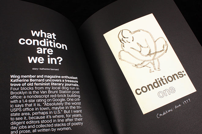
JOURNALISM: ‘What condition are we in?’ is a great article by Katherine Bernard, in which the Wing member and ‘magazine enthusiast’ uncovers and describes old issues of Conditions magazine, a mag wonderfully subtitled ‘A Magazine of Writing by Women, with an Emphasis on Writing by Lesbians’

PHOTOGRAPHY: An interview with cover star Adwoa Aboah is accompanied by photographs by Renell Medrano. Aboah is the founder of GURLS TALK, a platform described as ‘a safe space to share and listen without any judgement or stigma’. In this interview the activist and model discusses work, rest and community.

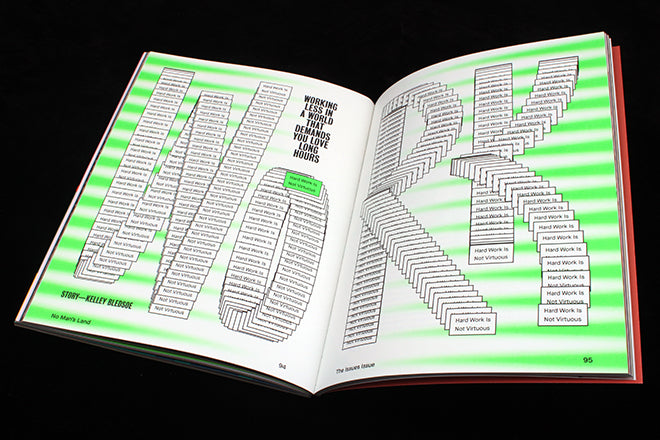
TYPOGRAPHY: Designed to mimic a click and drag glitch, the word ‘WORK’ has been made up of hundreds of tiny little ‘interactive’ bright green buttons each labelled ‘Work is Not for the Virtuous’: the title of this article. The team at Pentagram looked at activist graphics to inform their design, and the result is refreshing: rather than patronisingly feminine, the bespoke type is playful and modern.
Executive editor: Deidre Dyer
Design: Pentagram
Order a copy from the magCultrue Shop


