Out now: A New Type of Imprint

A New Type of Imprint is created by design agency Anti from Norway – and the contents inside sets out to represent the agency as well as the Norwegian creative community in general. What first struck us was how the cover of both issue one and two stencil the name of the publication into the card: the result is both arresting and subtle. Issue two is entitled ‘Conversations on Creativity and a Study of Time’ – and so the dense, thick publication is a deliberate slow burner, with plenty of white space to allow for lingering on the page.


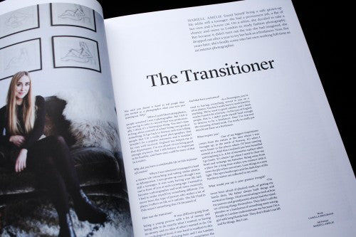
The magazine is divided into three sections, beginning with profiles on creatives living and working in Norway. The interviewees range from an interior photographer and a gallery owner to less obvious choices like a mechanical engineer and fishermen who test the durability of wristwatches by taking them out to sea. The design of the section is controlled and simple – taking a three-column format, and balancing titles, subheadings and text carefully within this structure (above).

What makes the publication visually and editorially distinct from other magazines of its ilk is the second section. This middle is a kind of mini-magazine, and the editor has handed over creative licence to designer Henrik Wold Kraglund and illustrator Oscar Gronner for roughly 30 of the pages (above). The pair’s graphic spreads contrast the minimalism of the rest of the publication, and add a sense of flavour and depth.


This middle section boldly stands out, and uses contrasts of pastel shades with vibrant colour to showcase the work of various Norwegian artists. An essay pondering the nature of time (above) – a whimsical mixture of the philosophical and colloquial – is accompanied by palm-tree like shapes that seem to abstractly evoke the time it takes for natural forms to grow (also above). This section of palm-trees then organically transition into a feature on a project entitled ‘The Future Library’ taking place in a Norwegian forest (below). The pages are visually linked by a pastel green although they might not be similar thematically, and this small design element is effective in creating flow between the separate features.


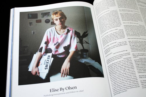
The third and last section of the magazine returns to the minimalist format of the first, but continues to look forward towards the future. This section profiles young and emerging creatives, for example a 15-year-old editor-in-chief of a magazine for young people called Recens (above). By paralleling the first section in its format and style, the magazine looks to the future whilst simultaneously rounding off and ending on the same kind of note that it started on. This gives A New Type of Imprint a sense of completion as you come to the last pages. It’s a very well structured magazine, and it takes you on a narrative journey in the same way that a book might – with a surprise in the middle to catch you off-guard.
Editor-in-chief: Veroncia Mike Solheim
Art director: Andris Sondrol Visdal
Review by Madeleine Morley
a-new-type-of-imprint.myshopify.com


