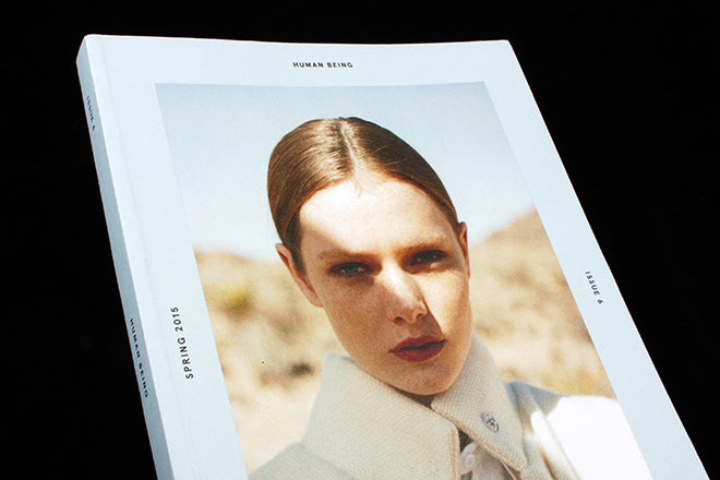
Out now: Human Being #6
Human Being has a clear concept, expressed in its name: it’s a fashion-bent magazine about people, specifically the people behind innovative brands and creative projects. Produced by clothing/ lifestyle store Needs Supply in Virginia, the publication has paired up with Danish menswear label, Soulland, for the new issue. Their theme is ‘In Plain Sight’, centred around the idea that fashion is now drawn to ‘the ordinary’, a movement the editors describe as ‘the age of the great Kinspiracy – that supreme and relentlessly same “way of life” caricature. It turns out nothing is uglier than ‘when everything is pretty’. The magazine’s soft grey/ blue palette and simple two-column format matches their focus on understated transparency.

One thing that is noticeable throughout, and which rings in their nod to ‘Kinspiracy’, is the way that Human Being emphatically incorporates the cultural impact of contemporary magazines into the way that they critique and document fashion. At the front, they speak with six influential ‘humans’, the first of whom is Fantastic Man’s Gert Jonkers (above). Elsewhere, in-depth profiles are accompanied by photographs of a studio’s magazine-filled shelves and by pictures of interviewees flicking through mag pages for inspiration (below). A small essay on typography entitled ‘Plain Type’ explores fashionable typefaces throughout the ages, encouraging you think about how a magazine chooses to ‘dress’ itself and how this reflects contemporary thinking as much as clothing does.


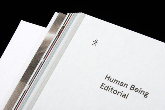
Although the design isn’t necessarily something we haven’t seen before, subtle elements add a sense of personality to the hyper-minimalism. Mini-stick men dot the left corner of spreads (above), and an interview with bag designers Building Block nicely wraps text around a photograph of the two interviewees, a simple (but rare today) coming together of text and image (below).


A spread of guns (above), a photo-shoot of empty ghost-town landscapes (above), and a project by Danish research studio I’m a KOMBO reconsidering US prison food (below) gives the overall magazine a specifically American vibe. The execution is stylish and inconspicuous, though: more Wim Wenders’ Paris Texas than overtly Americana. The issue seeks to look at ‘quiet design that belies a lifetime of refinement’, a statement that seems to reflect the magazine’s own sophisticated outlook.

Editors: Silas Adler, Tag Christof and Jacob Kampp Berliner
Design: Eric Gilkey


