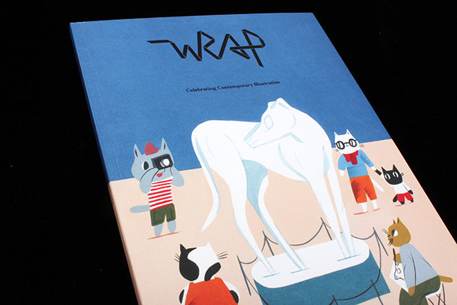
Magazine of the Week: Wrap #11
As this week’s Printout event reminded us, illustration is one of the key tools for magazine makers. And if there’s one magazine that’s on top of the subject, it’s Wrap. With their tenth issue they reached a new level of production and editorial quality, and they’ve pushed those values further again with the new eleventh edition, themed ‘Balance.’
 By now we know the basic concept: Wrap is part bound-magazine, part pull-out illustrated poster/wrapping paper. Issue-by-issue the two parts have become increasingly well-combined as the creative team get more confident, and for this issue the tipped in papers sit really well in the context of the magazine, such as here (above) where Clay Hickson’s sheet sits against a double page photograph of his postcards in a rack. The reader is immersed in his work, the crisp quality of the new print set against the softer finish of the photographed postcards.
 The choice of illustrators for the five pull-outs is as strong as ever: as well as Hickson there’s Linda Linko, Peter Judson, Sophie Douala and Alex Walker. Each works with the Balance theme, and as Wrap editor Polly Glass explained at Printout, she and creative director Chris Harrison work closely with the artists to get strong, representative pieces from them, and as these close-ups indicate, the results are beautiful. I’m not giving too much away here; the full-size pieces are even better: vivid fields of pattern and colour that take full advantage of the A2 fold-outs (below).


As well as interviews with each of the five featured artists, we get to meet New York-based cover artist Ping Zhu. The Wrap team have gradually been adding commissioned photography to the mix and Katharina Poblotzki’s shots of Zhu at work (below) add further depth (of course she owns a dog) to a great piece about her career and practice. Again, large scale photography sets off the illustrated work elsewhere in the issue.


Another great addition to the issue is a commissioned series of images, a visual essay, from Lauren Rolwing in which she uses her poster-like style to describe how her life and work are intertwined (above).
The issue also takes a look at the current trend for using photographic sets as illustration – making good use of a section of gloss paper – and takes us to Australia for a look at product and textile design.
 The inside covers and section openers use single-colour illustrative patterns to set the mood (see the halftone opposite the ‘Balance’ headline above) and the back cover signs off with a companion to the front cover art, the roles of the dogs and cats are reversed (above).
But the best thing about the magazine is it’s simplicity. Packed with colour and imagery, Wrap could easily be chaotic. Instead, it is a stunning piece of contemporary editorial work that has all the neccesary parts in place but nothing extraneous. The character comes from the carefully chosen content, the confidence of it’s presentation, and the sheer tactile joy of the physical thing.


