


Richard Baird, LogoArchive
This week we meet London-based brand identity designer Richard Baird, the man behind BP&O, a site dedicated to brand identity review. This has developed into LogoArchive, a series of beautifully produced zines that stem as much from his background in product design as his current branding practice. Issue three of LogoArchive is currently available.
Tell us about your typical Monday journey to work.
I live a brisk 20 minute walk from the studio space I work in, which is just off Whitechapel Road and on the street where Jack The Ripper claimed his first victim.
I like to get up early, around 6.30 and be out by 7.00. It’s a pleasant walk when the sun is out. Having lived in Prague for seven years it’s good to be back in the UK and around a diverse community preparing for the day, setting up stalls, leaving the Whitechapel tube station or coming in to work on the Crossrail site.

Describe the state of your desk and what you can see in your office
I’m lucky to have desk space at Jack Renwick Studio (JRS), amongst a talented team of designers led by creative director Jack Renwick. Having been kindly invited, I like to keep a tidy desk and bring in books and magazines – anything where there is a compelling synergy between content and form.

The building was a warehouse in the past, so the view is of the bricks of the building next door, although they do let in the smell of the coffee roasters below.

The studio space is distinctive. It is one of chipboard, exposed beams and ventilation pipes, strip lighting, corrugated steel, wire reinforced glass roof windows, bookshelves, a neon sign and walls covered with studio work. Set within this there are modern white desks, Macs and desk chairs, a kitchen and long tables for making, reviewing, eating and drinking together. There’s a real sense of design meets industry here which is fantastic.

Which magazine do you first remember?
I’d love to say Emigre, The Face or Eye but it was really FHM, Maxim, Nuts and Zoo. Those garish lads mags of the early 2000s when I was in my teens – they were bright, loud and seductive. I’d move freely between them monthly, no loyalty. Collectively they had character, graphically speaking, but lacked nuance.

Which magazine matters to you the most right now?
Real Review has had profound impact on me as a reader, writer and designer. Its strong sense of purpose and the synergy between content and form really sparked something in me. Pages of solid text and an exquisite corpse of image by way of a vertical fold are beautiful gestures. Being able to interview Jack Self for one of my zines was one of the highlights of my first year in London.

Can you describe your magazine in three words?
Light. Experimental. Unusual.

You have made a name for yourself reviewing brand identities, initially on your website BP&O – what is it about logos and branding that draws you in?
Over the last eight years of running BP&O my interests have shifted. Initially it was about communication and style, then strategy, and now in the way brands can help us to understand our selves. Put differently, how we can find and measure our values through different and competing brands.
An effective brand identity captures and expresses its spirit and values, and then seeks to find and engage with those who may respond to and be changed by this. I also enjoy the craft and creativity of a good symbol. A graphic form in which to receive and hold all the experiences someone has had with a brand.
Further, in the curation of brands within our lives, as with objects, friends and experiences, we may bring to consciousness our unconscious selves. This is what draws me in, that potential for individual growth and transformation.
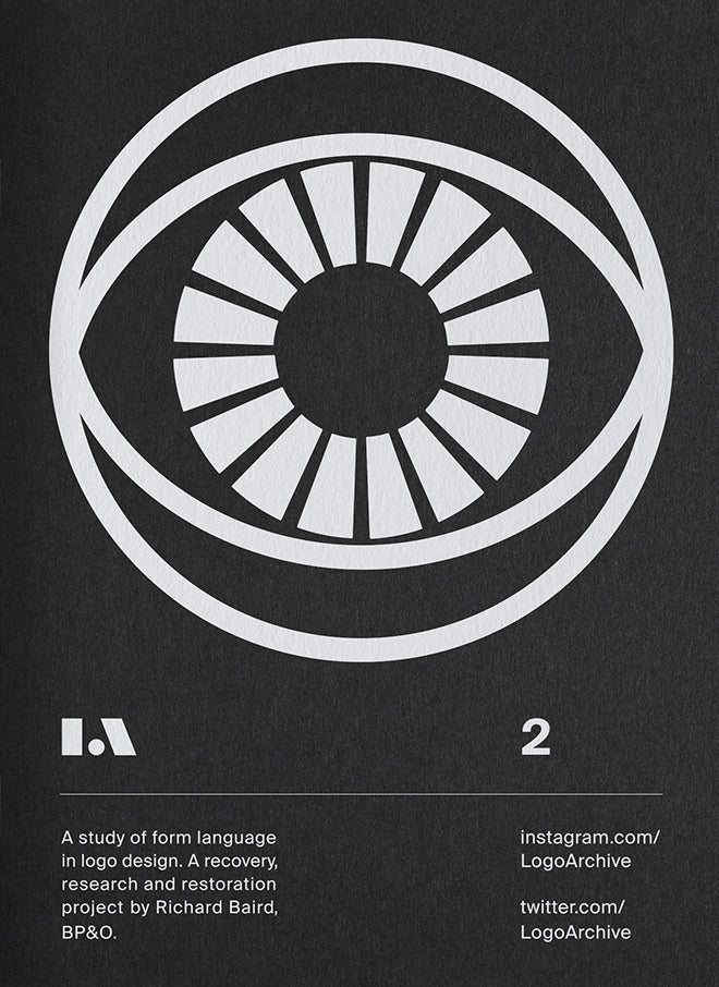
The magazine is quite distinctive, with white ink printed onto black or coloured paper, which can’t be easy! Can you talk us through the decision to print it this way?
LogoArchive began as an Instagram account. It collates mid-century symbols drawn from historical material sources. I’ve been collecting these for a while, with the help of Blair Thomson (canadamodern.org) who designed the LogoArchive Extra Issue (below) and Christophe De Pelsemaker of Logo Books & Letters As Symbols.

By inverting the typical logo book (black ink on white) I sought to appear distinct and to draw the eye into the symbol – running white ink on black uncoated stock seemed the perfect fit, and an unusual and unexpected mode to share this kind of content. Building up layers of ink felt like a very material gesture and process.

Alongside small details such as black staples, Colorplan paper, precise binding and selecting just a few symbols there is a synergy between the craft of the content and their presentation.

There are, of course, compromises to be made. It’s difficult to get a bright white without the expense of a block foil of screen print. The approach was to use a HP Indigo and run the zines multiple times to build up the white. The difficulty is keeping everything aligned each time the sheet gets fed back into the printer for more white — this happens six to eight times. If slightly off, fine lines can become thicker. WithPrint did a fantastic job to keep everything aligned.
There can also be problems with the coating of the stock in which the ink doesn’t take and you get a powder residue. Or if the zines aren’t run enough times to build up the white, creating an inconsistency between issues.

Logo Archive is unusual in that you have tried to grow and expand the range and breadth of sections each issue. Will it keep on growing or do you have an ideal format that you're working toward?
The basic premise is one of reconfiguration. The symbol portion, the black booklet, is the vehicle in which to move the inserts, which are a space for me to play with ideas, ways of writing, typesetting, materials and production. There should be something new and unusual through the middle of each booklet. Something that allows me to share current interests, design sensitivities and an ongoing story. In this way, it has a lot in common with fanzines of the past. I’m not working towards an ideal format, I just use it to openly experiment.
What’s going to be the highlight of the week for you?
Finishing issue four. The booklet is laid out and I’m finalising the text and design of the insert. This next issue explores the architectural (and literary) notion of wrapping: one narrative inside another — by way of theme (architecture logos) and in form: a zine within a zine.
What are you doing after this chat?
Invoicing, accounts, client e-mails and press checks. I may actually get round to designing something this afternoon. Mondays are usually this way. If I’m helping in-house, then it’ll be a Monday morning briefing, touching base with the JRS designers and the creative director.