RIP Tony Elliott
A couple of weeks ago it was announced that Time Out founder Tony Elliott had died after a long illness. I was art director of the mag back in the nineties and wanted to share a few thoughts about the man and his magazine.
During my three years at Time Out (art directors seemed to only ever last three years at the magazine) Tony was every bit the boss, at his desk every day and engaged with every part of the business. Compared to other, noisier, publishing figures of the era his was a quieter presence but none the lesser for that. His presence was strong.
Time Out was at the top of its game: sales figures – it was still a paid-for title, costing £1.50 – were set around 90,000 a week. We produced an annual Student Guide, a London guide, a whole range of city guides for Penguin Books, and an Amsterdam edition of the magazine. There was even a set of city guides produced for the Apple Newton mobile device. What had launched as a one-man student start up in 1968 developed into first a London-centric and then an international publishing brand.

At the heart of all these products were the listings: raw information researched, collated and edited before presentation in the signature Time Out style.
That visual style was built on the long established typographic combination of Franklin Gothic and Century that I inherited (from its defining art director, Pearce Marchbank). The classic mix of heavy sans serif and delicate, readable, serif is still embedded in my mind from my years at Time Out. It was the very heart of the magazine, the biggest challenge to replicate when we moved from Atex to Apple Mac make-up, and from the art director’s point of view the axis of your relationship with Tony.
The power of this base typography and the listings pages built using it can’t be over-emphasised. For several decades, Time Out’s tight columns of dense text simply was London. The page architecture was as distinct and familiar as that of the city itself: four columns divided by vertical rules, bold horizontal rules with white out titles, Franklin Gothic headings, Century text.


The content was as instantly recognisable as the form: the alphabetical listing of cinemas in the Film section and the sometimes curious delineation between West End and Local venues; the way the smaller sections contracted to accommodate the larger ones (the weekly flatplan meetings could be brutal).

Teams of writers and editors worked full-time preparing the listings information, creating an opinionated, weekly directory that was at once incredible in its extent and yet almost impossible to negotiate for the very same reason. An average week would see over 60 pages of listings, there was too much. Just like London.
Designer after designer, including me with a year-long dalliance with the typeface Meta, attempted to guide Tony away from his beloved Franklin and Century. Talk about a fool’s errand: Tony knew the power of what he had and was never going to shift. (Even today, the free edition of Time Out majors on Franklin, though the Century has been improved by the very similar Tiempos).
If that makes Tony sound essentially rigid, think again. He was a huge enthusiast for magazines of all types – he invested in i-D to help its survival and was surrounded by them in his office. He invested in distribution, helping many smaller magazine develope an audience. Just one example of his ongoing legacy is the magazine distribution company Ra & Olly, who even today distribute Time Out in London, as well as supplying indies to shops like ours.
Tony always wanted to know what you thought; when the first issue I designed came back from press he noted a link between the cover and Arena magazine and waited for my response (non-plussed); when Wired launched he excitedly shared a copy with me, demanding to know what I thought (we agreed it was brilliant).
Despite the subsequent struggle to adapt Time Out’s editorial muscle to the internet, his appreciation of Wired was as much to do with his passion for its subject area as magazines themselves. He championed new technologies (those Apple Newton guides) and insisted I take an Apple Plus home and test the pre-browser world wide web.
Perhaps the most important thing about Tony was this genorosity of thought and general lack of materialism. Having built a fortune providing information about the arts to audiences, he put it to use in supporting the arts rather than flashy cars or exotic clothes. The Roundhouse and the wonderful Manchester International Festival were two of the organisations that benefitted from his support and experience.
Not that he believed in art for art’s sake; the last time I saw him was at a theatre show last year. Bumping into him as we left the venue after a long performance, his opinion was blunt. ‘That was rubbish,’ he said, grinning, a typical spark in his eye challenging me to disagree. I couldn’t.
The original, London edition of Time Out has been on hold since lockdown but is due to return in August with an issue dedicated to its founder. I look forward to that issue giving him the appropriate send-off – Tony Elliott gave more to publishing, especially here in London, than can be outlined in this quick post.
RIP Tony.
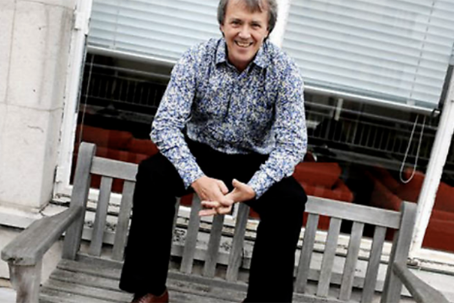
The portrait at the top of this post is from the Time Out website, uncredited, and looks like it was taken at the top of the old TO office on Tottenham Court Road, my time at the magazine. The images of Time Out pages are from a May 1994 issue.


