Sara Frostig, art director
For this week’s Issues we hear from Sara Frostig, art director at Scenario – a briefing on trends, ideas, visions and possible futures. Besides her work with the magazine at Copenhagen Institute for Futures Studies, she is a lecturer on magazine design and jury member of a Nordic magazine design award.

We asked Sara to select from her magazine collection, a new issue, an old issue and one other thing.

A new issue
My current favourite magazine is Pan and the Dream. This first volume concerns itself with the naked form, and manages to communicate this delicate subject implicitly and unpredictably. The magazine’s collages give the opportunity to illustrate stories in unseen ways while allowing the reader the potential of making their own connections.
Another thing about the magazine’s collages is how they tend to add a third dimension of different layers. I’m especially in love with the cover. The tag is sown onto beautiful Munken paper, which makes Pan and the Dream a very tactile and sensible experience. I like the white space – white space of different whites. The simplicity is admirable.

An old issue
Pist Protta is a Danish art publication established in 1981. It consists of written content, art prints and photos by both national and international artists. As well as contributing to art history, this magazine represents a very free and experimental way of creating magazines. Every single issue is different from the others. Not just in content or theme – everything – from its concept, size, typeface, paper quality, and print method all these factors change every time. It adds up to more than 70 originals so far.

And another thing
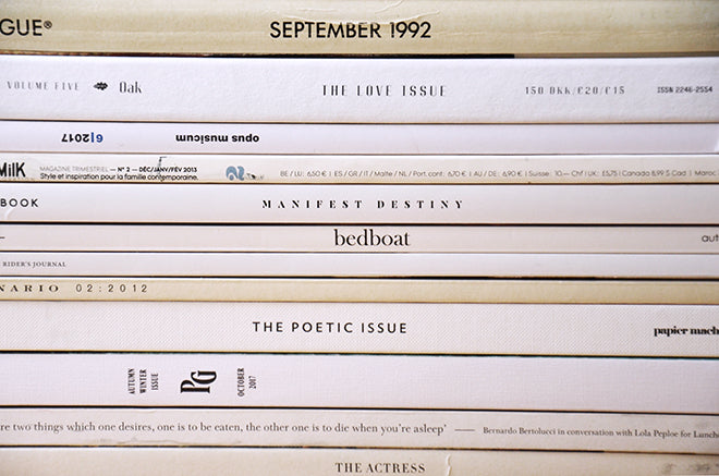
Just like simplicity is balancing on the edge of being dreary… I have a thing for monochrome covers, especially in combination with a metallic hot stamp. For me covers speak louder with simplicity, washed out colours and tactile elements. They tend to pop out among neon call outs, eye contact and glossy paper…


