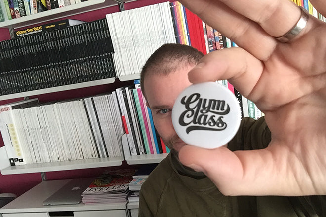
Steven Gregor, editor and art director
It’s impossible to say enough times just how fantastic the new issue of Gym Class is. As Jeremy described in his recent article about it, issue 14 really does include something for everyone, whether you’re a writer, illustrator, designer, or simply someone who loves magazines.
Today, we catch up with the ultimate mag-lover and Gym Class editor Steven Gregor to take a look through his impressive collection of printed matter. Spine after spine cascades in alphabetical order along the walls of his perfectly formed Barbican flat, but we asked Steven to select just three magazines from these shelves.
We asked him to pick a new issue, an old issue, and a detail from a magazine that he finds especially fantastic.
New Issue: FAT, Edition 2015, The Nordic Issue
Up front, I’m not sure how new this issue is. Jeremy wrote about it back in January. But it’s new to me. I saw it in a shop for the first time a couple of days ago and was all like... Get. In. My. Belly! It's a must have! Mag-fan peeps might remember Kasino A4 magazine from Finland. This magazine is made by many of the same people behind Kasino A4... and it’s a bit like Kasino A4 re-born. (How many times can I say Kasino A4 in this paragraph... answer: not enough!)
FAT (which stands for Finnish Art Today) has great, contemporary design... but it’s the humour and pitch-perfect tone of voice that really does it for me. This magazine is super inspirational... it’s kinda what I’d like Gym Class to be.
Old issue: British Elle, June 2010 (subscriber cover)
This is heyday British Elle. That's not to say the current team aren't rocking it... for sure, they have their moments. But the dream team of creative director Marissa Bourke and art director Tom Meredith were on fire around 2010. Pure high-end class. (In fact, the whole art and picture desks were on FIRE... H-H-HOT property!)
This subscriber cover... Kylie Minogue shot by David Slijper... is brilliant... and beautiful. And the cover line, Come Into My World (the title of a Kylie song), works perfectly too.
And another thing: COS magazine, spring/summer 2015
Edited by Gert Jonkers and Jop van Bennekom (in collaboration with COS) and art directed/designed by Jop, Veronica Ditting and Helios Capdevila... this tidy little customer magazine is pure indie mag A-list. When I hear that a new issue is about to drop... I’m camping outside COS on Regent Street. Well, that's not actually true... but... I’m tap-tap-tapping Uber and telling the driver... get me to COS ASAP! COS ASAP! COS ASAP! DRIVE! FASTER!
What makes this particular issue special is its theme... paper. It’s a tribute to all things printed and paper-y. It's printed on multiple paper stocks, natch. And each new paper section is sign-posted with a little note giving details of the new stock (E.g., name, gsm, colour, texture, etc) and it’s perfect use (E.g., magazine or book cover, paperback text pages, fashion catalogues, etc). OMG IT'S A WET DREAM.


