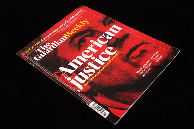
The Guardian Weekly
The Guardian newspaper has been publishing an international weekly edition in print for almost a hundred years. An early vanguard of the newspaper’s new-found international audience, The Guardian Weekly has republished the best of the daily’s international news coverage for English-speaking readers across the world since 1919.
Following this year’s complete redesign of the daily paper, The Weekly was left in design limbo, an uncomfortable mix of new masthead, previous generation typography, and a page format that meant every copy had to be cut down from tabloid size – a waste in every respect.
In this cost-cutting era it might easily have been just the kind of side-project to be closed down, but instead The Guardian Weekly is relaunched today as a weekly magazine in the UK and internationally. The above image shows last week’s final newsprint edition alongside the smart new magazine format.
The team, led by editor Will Dean and director of publishing Mylene Sylvestre started with audience research and it was soon clear how devoted their readers were. ‘They have a really intense relationship with it,’ explains Dean, ‘One bloke started reading it in the forties in Burma flying in the Canadian Air Force and has read it ever since.’
Others valued the amount of content in The Weekly. ‘We heard “this is something I sit down and read over a week” from many readers. We realised it was regarded already as a magazine in the guise of a newspaper.’ said Dean. ‘We wondered… would it make more sense to start trying it as a magazine?’ This logic was supported by further research with non-readers.‘I remember a group in Paris who were unfamiliar with the old Weekly, and they were confused by the newsprint format.’
Fast forward to today, and now it’s a standalone magazine. Design director Chris Clarke has applied The Guardian’s new design language to a magazine environment and it works really well.
Newspaper designers talk of the difference between magazine and newspaper design, of the need not to distract from stories with design fireworks, and Clarke largely follows that direction. The new Weekly does not strive for the graphic flambouyance of, say, a Bloomberg Businessweek; yet it also more graphically ambitious than The Economist.
It makes strong use of the elements available in The Guardian house style. The boxed-in text columns, colours and the layered combinations of infographic and stock imagery (above) are all familiar from the daily newspaper. There’s still plenty to read but the smaller pages mean long texts are a little less daunting.
Although a digest of the week, the magazine must be ready to slot in a big story that lands at the last minute – the Brett Kavanaugh cover lead (above) in the launch issue being a case in point. This is not slow journalism – when asked about Delayed Gratification and Positive News, nobody bites – but clearly doffs its hat in that direction.
The Guardian Weekly has enough of its own identity that it will appeal to readers who maybe don’t even know of the daily newspaper – a key constituency according to Sylvestre, ‘Internationally, a lot of people are aware of The Guardian as a news site but they might not know that we have a daily paper.’ The team hope the new title will build on that growing web audience, reflecting a growing belief in print. ‘Readers were saying they wanted a haven, some calmness away from the crazy deluge of news,’ Sylvestre added.
As well as researching readers and potential readers, staff from the US and Australia newsdesks were canvassed. As a result both countries will have four pages of local stories in their edition of The Weekly.
Clarke had already led the design development of multiple supplements for the newspaper’s Saturday edition, but these didn’t need to sell on the newstsand. Was it hard to adjust to the harsher context of a paid-for title? ‘It was fun. The magazine has to have a presence on the newsstand that it may not have had before, but that doesn't mean you have to always shout. You can whisper quite forcefully and still be seen.’
Its exciting and rare for a large publisher invest in such a creatively-orientated project these days. Time, money and creative effort have been poured into it and it deserves to be a success. Try it!
Asked whether the new publication is a first step towards the daily newspaper becoming a magazine, all concerned delivered a clear ‘No.’
Art director: Andrew Stocks


