

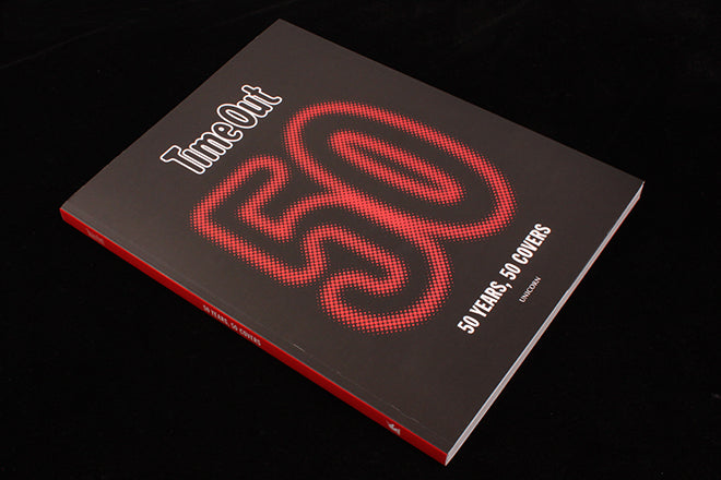
Time Out: 50 Covers, 50 Years
There have been a series of magazine anniversaries recently, as titles that launched in the late sixties mark their 50th birthdays.
That era spawned a number of anti-establishment, anti-consumerist yet very successful magazines and is long passed, but the desire to mark their history remains. New York magazine published a beautiful and vast book earlier this year, and Interview just relaunched with original launch cover star Agnes Varda on its cover 50 years on.
Time Out’s is the latest anniversary, and this new book celebrates those 50 years with 50 front cover designs. We learn a lot about Time Out from this book, some of it deliberate and some less so.

First, the good news. Pearce Marchbank’s 1970’s cover designs have long deserved greater recognition and several favourites are here. As a former Time Out art director (mid-nineties), I know how they set the tone for every future cover at the magazine. Founder Tony Elliott would regularly pull out from the archive Marchbank’s covers to demonstrate what he wanted. In particular the green ‘Jealousy’ cover (above) was a benchmark to meet.

A good dozen of the 50 covers here are Marchbank’s, all great and worth the book alone; the one above is a good representation of the scope of the magazine, swinging between politics and consumerism. It leads boldly with the anniversary of Gay Liberation, with a yellow flash added to highlight a guide to tennis lessons. All using Franklin Gothic, a key part of the magazine’s visual identity introduced by Marchbank and still used today.

Most of the covers are reproduced approximately full-size, which is satisfying, but goes awry when we look at the original small-format issues. The book opens with the very first cover (above) blown up larger than the real thing, which is clumsy. The abstract nature of this and other early covers clarifies Time Out’s early position as part of the sixties alternative press (below).

My period at the magazine marked it’s highwater mark in terms of sales; I’d love to credit that success to my designs but in fact the nineties marked the point when that balance between politics and consumerism swung more towards the latter and chucked in a hefty dose of celebrity. The magazine was hugely successful in that pre-internet era as everybody in London, it seemed, read it and everybody wanted to be on its cover. My Tuesday morning commute allowed me to test my front covers in real life: half the tube carriage would be reading the new issue.

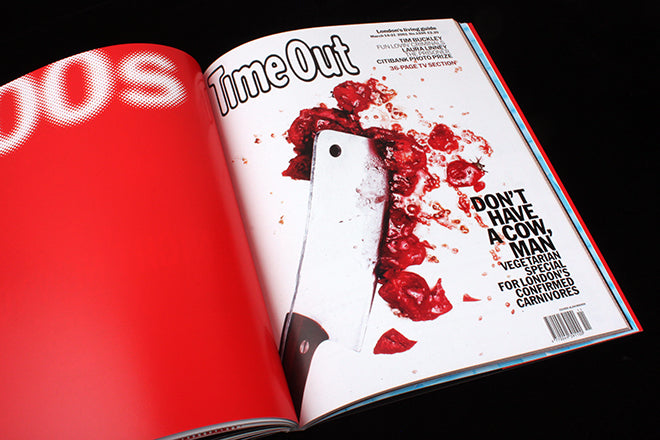
Two covers designed by me are included; a Warhol-style treatment of Joanna Lumley is exactly as that sounds, though I’m pretty sure we took the idea further and printed three versions in different colours so that newsagents looked like screenprinted triptychs for the week. We continued with serious issue covers too, such as this example (above) that also made the cut for the book. For the record, the ‘cocaine’ of the logo was wall filler.
Like so many at the time, the magazine struggled with the arrival of the internet. This was more an issue of strategy than lack of will as Elliott was always engaged with technology. I remember him overseeing Time Out city guides for the early Apple Newton device and encouraging me to try out the pre-browser world wide web via modem. I learned about a then new magazine called Wired from him. But the magazine fell behind in the race online and took an age to catch up.
Time Out is now a global brand, online and in print, with 108 editions published in cities across the world. Whereas once the challenge for the designer was one of information design – how best to help the reader navigate the mass of listings published in print each week – that material is now best presented (and searched) online. This and the fact the magazine moved to a free model a few years back mean each issue is far slighter than before, and the cover less vital as a sales tool.

Nonetheless, the London magazine has continued to reflect its time and place. A series of designs react to the modern era, such as this response (above, designed by Micha Weidmann) to the 7/7 attacks. Strong, direct and meaningful, it has an urgency that reflected the mood of the city at the time. Another strong cover from the early noughties was this one (below), art directed by Balwant Ahira.
Today, most Time Out cover designs are stuck behind a wraparound ad that obscures the magazine’s editorial welcome.

The move to free saved the magazine – it now distributes more copies than it ever sold, so advertising reach is wider than ever. Yet there remains something essentially sad about this cover of the first free London issue in 2012 (above). Does the headline refer to the reader, or to the advertiser? The message and the design sits weakly alongside the 7/7 cover above despite their surface similarity.
‘50 Covers, 50 Years’ is a useful book that makes a claim for Time Out’s place in publishing history. It is also a pretty accurate reflection of the magazine itself, which is not as complimentary a comment as it might first sound. Sit the book next to the ‘50 Years of New York’ tome and the contrast could not be more extreme in terms of ambition and achievement; one a hardback tour de force, the other more magazine-like in production terms. Compare contemporary editions of the two magazines and you’ll find a similar variation in scope.
Charting the rise of the magazine from alternative zine to global brand, the book’s focus seems stuck somewhere back in its 20th century heyday. Copious quotes from the great and good all come from an older generation of famous Londoners. Is Time Out overlooked by today’s readers and cultural figures, or just taken for granted? I suspect a mix of both.
The magazine remains known and trusted, cities, especially London, remain a great subject for a magazine. We stock the weekly at our shop and several regulars pick up a copy. The covers today tend to be illustrated, bright and cheerful if slightly samey. The website sells tickets to events it previews and the success of the Time Out food market in Lisbon looks set to be rolled out in other cities. Tales of heavy cost-cutting and reduced staffing continue.
Other free magazines have launched and failed – or in the case of NME followed Time Out to free and failed. That Time Out is still available in print is an achievement in itself, and this book establishes a clear arc from decade to decade. That that arc is one of editorial decline is, however, something the book struggles to avoid.