

Buffalo Zine #5
The arrival of a new issue of Buffalo Zine is always an exciting moment, promising some exhilarating magazine-making, and this one doesn’t disappoint. Unlike previous editions, it doesn’t parody another type of publication but instead is a messy, zine-y object based on the Hackney street where their office is based. ‘Sometimes you need to go local to find the universal,’ say the editors.

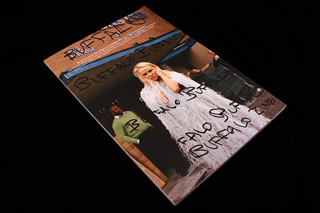
The issue opens with a note explaining that ‘Buffalo buffalo Buffalo buffalo buffalo buffalo Buffalo buffalo’ is the longest grammatically correct sentence you can make using one word (and also explians why the cover has the magazine name repeated multiple times). A diagramatic explanation of the sentence (below) intrigued them further and encouraged them to focus the issue on their immediate surroundings. The second image below, on the contents spread, makes the visual leap from the grammar to Hackney Road, the street their studio is situated on. Difficult to explain here in words, it’s self evident in print: the street scene is annotated to match the grammer chart.
 \
\
Fashion is mixed with found material from the long-gone businesses that once occupied the street, in particular a framers. There’s also a series of interviews revolving around the district – David Bailey recalls the Kray twins and their gang.
Meanwhile much of the fashion imagery revolve around the increasing rents of the area as it gentrifies. The point isn’t laboured, it’s just insinuated into the page: images with placards and collaged rent protest leaflets sit side by side, the current and the archive together reminding us this is not a new problem.
In other hands the combinations here might be predictable and dull. Instead, the different material is effortlessly mixed and the design and typography breathlessly engaging. Are those large photo credits a subtle typographic homage to Fantastic Man? Much of the text is slightly blurred as if poorly printed or aged. It’s just enough to add an edge and not be repetitive. I want to look again and again at the pages and their buzzy thrill.
I think it’s brilliant, quite unlike anything else being done today. The team’s ability to get this unique direction from some of the biggest names in photography is the reason it’s our magazine of the week.
And yes that is Pamela Anderson on the front cover, one of four different covers.
Editors: Adrián González-Cohen & David Uzquiza