

Fantastic Man #30
I still remember being shown the very first issue of Fantastic Man; it was astonishingly different to existing men’s magazines in 2005. With their 30th issue, founders Jop van Bennekom and Gert Jonkers have completely changed their magazine to astonish again.
The original Fantastic Man grew from the duo’s earlier Butt zine and dropped into a world of glossy lad’s mags. Instead of competing with these, the new magazine struck out in its own direction, and it’s hard to imagine a more stark alternative. While Loaded, FHM et al fought to be the most heterosexual mag on the rack, Fantastic Man reflected the interests and lifestyles of its gay founders. In this way the magazine established a new paradigm for men’s mags, marking out a new editorial tone against which every men’s magazine has since been compared.
29 issues later it is such a mainstay of the market that its success at reinventing the men’s market is easily overlooked; where once big titles like Esquire and GQ had to measure up to FHM, now they look to Fantastic Man. And what would online shop Mr Porter look like without the magazine?
The launch and subsequent success of new mags from the same publishing team – The Gentlewoman, The Happy Reader with its Fantastic Man-like lead interview, and the more conceptual, themed magazine for high street shop COS – have all built on the Fantastic Man identity and each in their own way has advanced it. But what next for the original magazine, the seed for all those other projects?
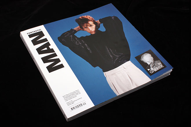
A clue came in issue 26, with its cover featuring five non-celebrity Portugese fishermen, and in the later issue featuring the eight ages of man, each age represented by its own cover portrait. These shifts were both intriguing and successful. And now we have issue 30.

The issue is so different in so many ways to those that preceded it, that it’s easier to outline here what remains the same. Thankfully, that is the character of the magazine. The linguistic quirks remain, continuing the edge of a non-English speaker writing in English. For example the issue opens with a listed manifesto, ‘What is FANTASTIC MAN’, the second item on which is ‘It is SQUARE, meaning each single page is as high as it is wide’. While obvious, this is vital vital – many magazines are nearly square; the definition of what square is confirms this one really is square. It is a typically precise use of language, almost pedantic.

And I love the square. The extra width helps the design, it’s a shame more mags don’t try it. It’s a large square – only slightly less tall than previous issues, but with added width. Think 12" record sleeve. Despite being a few pages less than the last issue, that extra width adds weight and heft. It’s a beast of a format.

Inside the magazine is unrecognisable; the new logo (ironically rather similar to the late FHM’s) and every other typographic element uses one font, Dinamo’s Diatype, in multiple weights. This is as bold a move as when Neville Brody launched Arena using only Helvetica, dropping The Face’s type gymnastics.
This simpler, cleaner approach carries through to the editorial grammer – the headlines and standfirsts are more direct and to the point. The result is simpler, tighter, tauter (there’s no more ‘Mr’ title before each name; indeed, there are fewer personality-led interviews).

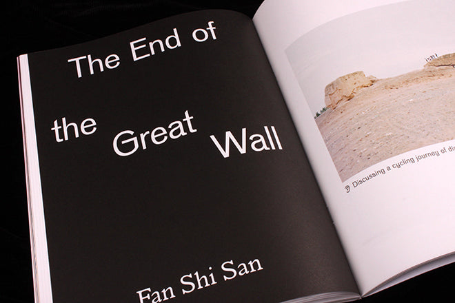
The issue is themed around the country of Greece, but future ones will take other subjects – not just countries – as their starting point. It’s the theme that allows the reinvention; the magazine is freed from the PR-led world of product selling to concentrate on ideas and their tangents. The result is a more relaxed, bookish feel (the new format emphasises this) with an element of timelessness that aligns it to other magCulture favourites like MacGuffin. In this respect it is thoroughly foward-looking; yet at the same time, a series of blue-tinted male portraits refer back to the Butt days (below).

It’s not an exaggeration to describe the new physical format, design and editorial concept as an entirely new magazine.
The new Fantastic Man tests the very idea of what a magazine is, boasting (correctly) in the afore-mentioned manifesto that ‘It occupies the unique space that magazines hold within media TODAY’ before adding, ‘It is an EXPERIMENT’. This first issue suggests a highly successful experiment; I’m fascinated to see where this leads.
Editor-in-chief: Gert Jonkers
Creative director: Jop van Bennekom