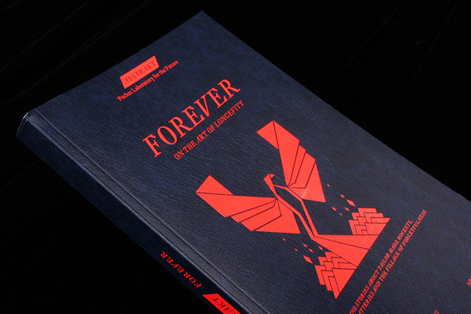
Abstrakt #14
When you first get hold of a copy of Abstrakt, you might think it’s an instruction manual for a secret society rather than a magazine, as the pages are adored with lots of geometric bird symbols and triangular shapes. It’s very enigmatic and abstract, a confounding leather-y publication with a lot of text and noir-like illustrations (below).
 The magazine is in fact produced by an interdisciplinary Zurich-based think tank called W.I.R.E, so the name Abstrakt actually refers to a scientific ‘abstract’. Each issue is a summary of the think tank’s recent work, which in some ways deals with the future, whether the future of business, the social sciences or the arts. Writers like Hans Ulrich Obrist and sociologist Richard Sennett have contributed musings in the past, and the bookish, colourful covers are always mysteriously alluring.
Issue 14, themed ‘Forever’, includes an eclectic range of articles; from a piece by the frontman of Berlin band Element of Crime to a report by the former US Secretary for Energy. The articles explore the tension between the short-term and the long-term – asking questions that range from the abstractly philosophical to the practical and political. As you read the contents, the geometric bird on the cover makes more sense: it’s like a phoenix rising from ashes, an immortal symbol of renewal and longevity.

 Text-based sections are laid out simply like a book (above), as is the contents page (also above), but stark use of colour contrasts and small icons create a sense of personality and confident energy. In some ways, the spreads combine the delicate simplicity of a literary magazine with the bitty, organized layout of a field guide: it’s a clean, powerful aesthetic that brings to life the academic content, just how you would expect a ‘Pocket laboratory for the future’ to look like.

 Infographics are playful though crisply designed (above), as is the graphic imagery (also above). The issue has a pink, blue, black and white pallet: few enough colours so that there is strong sense of cohesion, but enough colours to create contrast and difference. Smaller articles are accompanied with illustrations that make deft use of the colour pallet (below), and colour also causes a splash with a double gatefold spread (also below)

 Abstrakt is a curious and exciting find: it’s a magazine that has a strong sense of self, and its articles about the future of art, business and technology are both accessible and provocative.


