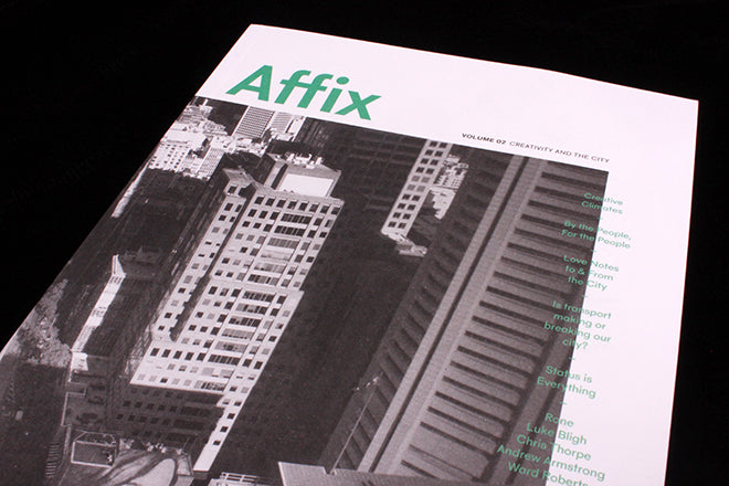
Affix Magazine #2
Melbourne-based Affix is about architecture and urban planning, and brand new issue two is themed ‘creativity and the city.’ There are lots of magazines and online websites with a similar focus – Urban Pamphleteer, Lobby and Spaces initially spring to mind – yet despite the range of others to choose from, Affix is worth taking a look at because of its intriguing selection of personal perspectives.
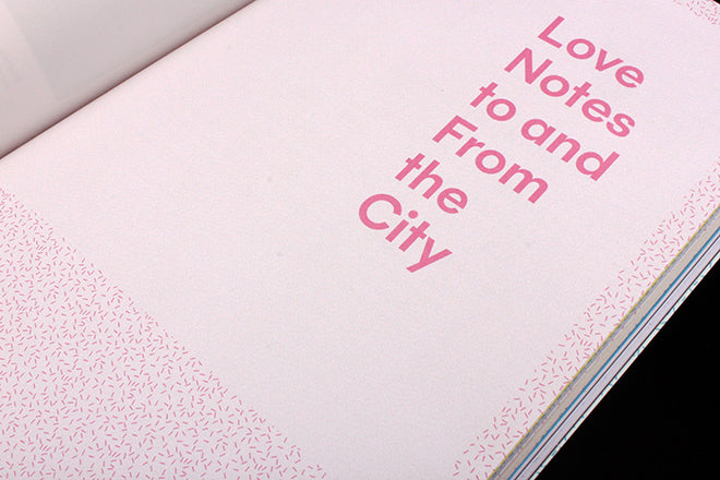
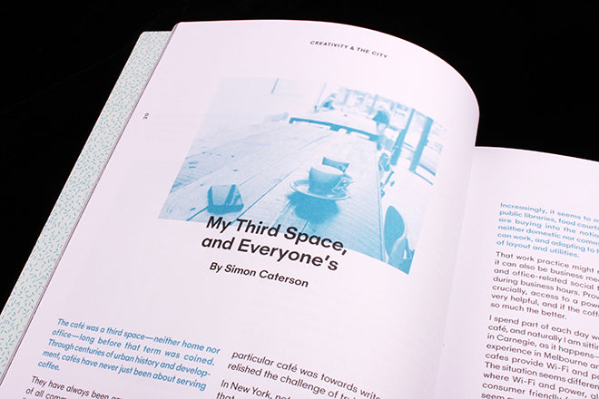 Since the release of their pilot issue in February, Affix decided to redesign, opting for pale tones, plenty of white space and the occasional flourish of a speckled background (above). Articles range from bitty pieces to longer opinion essays: I enjoyed an article exploring how cafés have become a newly vital ‘third space’ between office and home (above), and a short investigation into what makes particular locations in a city so Instagramable (below). Interviews with local graphic designers and photographers in the ‘People’ section are also a nice touch, and provide you with a sense of the individuals who live and create in a city.
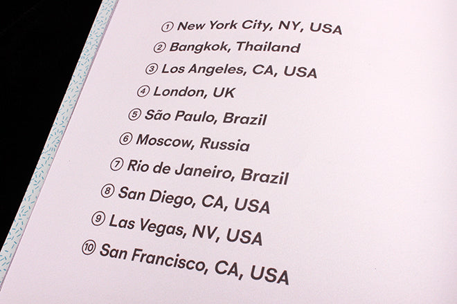
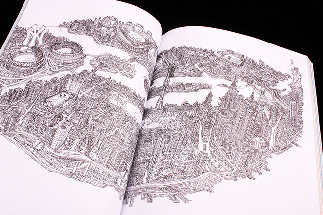
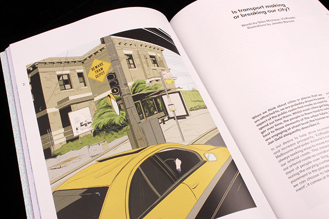 Affix also make a lot of use out of illustration and art. As the theme is ‘creativity’, they’ve opted for artistic renderings of a place instead of documentary imagery. There’s a set of Adrian Tomine-esque illustrations that are quite charming (above), and a dense, spidery map of NYC from a designer who knows the area like the back of his hand (below).
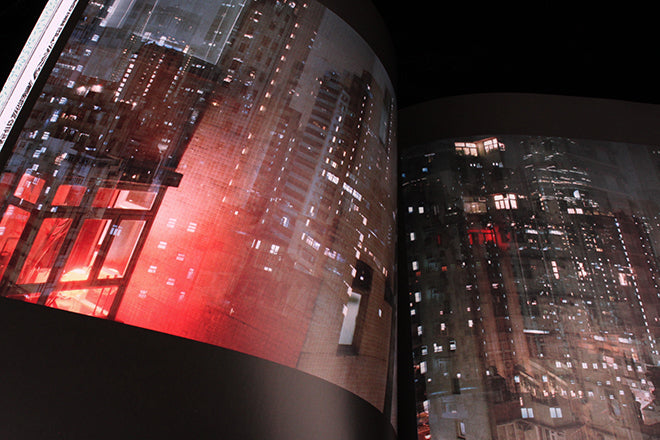 An interview with photographer Ward Roberts, who speaks candidly about his dreamy images of buildings at night (above), provides yet another thoughtful take on an artist’s life in a densely crowded city.

At the back there’s a blank section of pages where you’re supposed to sketch your own dream city – the idea is that readers can then upload their design to social media. This is a thoughtful touch: Affix uses the magazine format not only to share new ideas but to encourage them too.
Editor: Abbie Freestone
Art director: Akiko Chan


