AG (Architektur in Gebrauch)
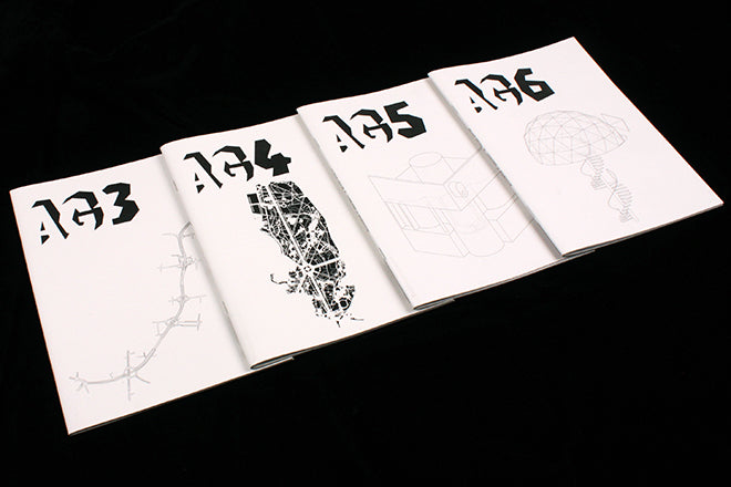
Some of the most aesthetically and editorially innovative publications that we’ve been receiving this past year have been themed around architecture – London-based Bricks of the Kiln and The Real Review are two potent examples. AG (Architektur in Gebrauch, Architecture in Use) is the latest architecture magazine to come to our attention: it’s now onto its sixth issue, it has a pleasingly simple concept and it hails from Berlin.
Instead of looking at space historically, AG chooses a different piece of architecture for each issue and observes it from the perspective of its present state. It does this to counter the pervasive approach found in architecture journals where “photographs capturing the moment of completion become the only instance of authority and the most influential moment”. I’ve noticed a rejection of this underpinning a lot of architectural editorial recently; the most striking example being the OMA website, where content is randomly collated from social media so that instead of slick images of the completed product you have images of architecture as seen by the people who live it.
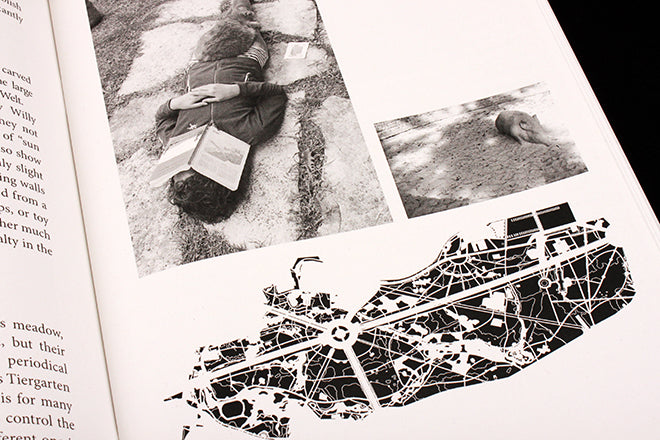
We were sent issues three, four, five and six (top) – the aesthetic is obviously clear and to-the-point. At first I wasn’t convinced by the logo, but on second thoughts, the shadow of the blocky text is well-suited to the magazine’s concept and the idea of not exploring the shining surface of an architect’s vision but the shadowy existence of a space, with all of its traces and lived experience. Issue four (above and below) is themed around Berlin’s Tiergarten – the writing takes shape as a list of observed details, from a wild boar to the water springs running through the park to the heroic historical monuments that scatter the space in abundance (also below).
New issue 6 looks at House Jumsai, designed by Thailand’s Sumet Jumsai. The approach of the magazine is less personal but still compelling – it documents the last days of the penthouse and is largely photographic (below).
Issue three explores the Mancunian Way that runs through Manchester (below). It begins with with an interview with Richard Brook, Senior Lecturer at Manchester School of Architecture, and then finishes with a chunk of photocopied pages from J. G. Ballard’s 'Concrete Island' (also below).
Every issue of AG is born from the same philosophy, but then the space that’s being observed dictates the overall approach. Each issue also then exists as a single publication in its own right, something I find particularly engaging.


