

White Zinfandel #Vl
Food and drink magazines come in many different guises but perhaps none stretch the form or come up with such surprising directions as New York’s White Zinfandel.
The 294-page, large format magazine makes a formidable first impression. Other magazines may be turning away from the exaggerated physical magaziney-ness of the indie world, but this one still relishes the tactile. Throughout the issue the paper is a beautiful off-white and superthin, with the resulting see-through from the back of the pages used to positive effect.
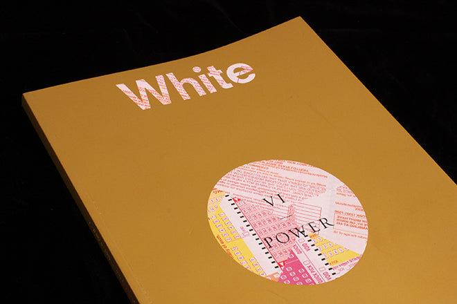
Then there’s the cover, covered in a thick coating of metallic gold ink like that used on lottery scratchcards. I think it actually scrapes off, but I didn’t want to try. It’s like Guy Debord’s book covered in sandpaper, except by using it you will damage the magazine itself, not other mags. The magazine name and circle in the middle reveal a collage of lottery cards beneath the gold; the page edges are finished in gold too.
On its own that’s not enough to make it our Magazine of the Week, but add the strength of the stories within and it makes an ideal one.
Earlier issues felt more grounded in food and wine; this one appears to barely mention either. Instead the issue, as beautifully designed as it is produced, carries lengthy articles around the theme of Power; the editor’s letter reflects on todays ‘power without morality’ and wonders whether this type of power is illusory, or ‘as transiently gratifying and ultimately indigestible as a decadent meal’. Food!
The stories mix fashion, culture and art, a familiar combination, but there’s something special going on here. An interview with designers Hood By Air is linked to a piece about Dietary Creep – the way our food choices have been overrun by health and lifestyle concerns — by Broken Banana, a series of images by artist Elizabeth Jaeger. The paper, quiet design and large pages hold these very different pieces together. Dietary Creep and other stories through the issue are presented in 30 point type , three times a ‘normal’ text size, yet it feels natural in the flow of pages. As do the empty pages splitting the image pages; this is where the show-through effect is at its effective.
A rare double-page image opens Just a Little Drop of Poison, a reflection on the power of poison over execution that manages to quote both Leonard Cohen and Edith Wharton; design professor Forest Young tells the story of how a monochrome image of US graphics hero Paul Rand led him to mistakenly believe the designer was a black man; Paloma Powers’ extraordinary proscuitto-inspired (!) red marble apartment is revealed; and the power of German discount supermarket is examined in a brief photo essay about a Greek Christmas.
As you can see there’s far more food in there than it first seemed.
White Zinfandel is a continually surprising magazine that is expertly edited, designed and produced. A completely different food magazine, I only wish we’d covered it properly earlier in its six-issue run.
And the name? Zinfandel is a wine grape popular in California and generally used for red wine. The white version is regarded as a cheap blended sweet drink enjoyed by people who don’t like wine.
Editor-in-chief/Creative director: Jiminie Ha
Art director: Fahad Al Hunaif