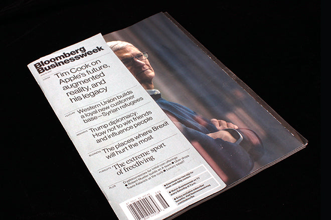
Bloomberg Businessweek redesigned
For a few years around 2009–2013 Bloomberg Businessweek was a touchstone for editorial designers. Previously an unspectacular if well-enough designed magazine, in the hands of new editor Josh Tyrangiel and creative director Richard Turley the weekly business title relaunched with multiple crazed levels of irony, sarcasm and visual spin overlaid on a calm, modernist set of grids and type styles.
It was a classic blend of restraint and mania: Tyrangiel and Turley both brought structure (Turley direct from a junior-level involvement in a highly-praised redesign of The Guardian) and applied an increasingly inventive selection of visual references and ploys to the cover each week. The new cover reveal became a twitter meme in its own right, and was accorded a ‘How we made the cover’ column in each issue.
Their tight working relationship was key to the project; when Turley left for MTV (and now advertising) and Tyrangiel joined Vice TV, the magazine struggled to maintain the same powerful direction. Their departures were probably inevitable – there was clearly some chaos behind the weekly making of the magazine that couldn’t be maintained, and Turley was clearly getting bored. But any doubt about the skill the pair applied to their collaboration was quashed by the way the magazine subsequently struggled to maintain the same direction. The irony and fun seemed forced, less intriguing and clever, more a ‘style’.
This week sees the first substantial redesign since that era, and it’s very good, in a quiet way. It remains quite recognisable: the basic font palette remains the same and many of the structural devices remain from before. But the layers of visual snark are gone: this time its for real. The result is a smart, modern business magazine that brings journalism to the fore. It looks simple, but this is now a magazine where every single element of content and design is stripped to its simple basics. Everything has to work, there’s no space for decoration or fuss. The regular sections up front are very tight, the feature well a little looser and more obviously delineated.
Most interesting, though, and the reason we’ve picked it as our Magazine of the Week, is the broader meaning of this redesign. The crazy Tyrangiel–Turley days of the magazine happened at a time when the relative calm and order in the Western world was beginning to break down. This was a time of the big crash, and the powerful deserved puncturing with knowing winks at the problems in the system. In so far as a weekly business magazine could rebel, it did.
But now we face the craziness of today’s world of Trump, Brexit et al. In a sense, our governments have unleashed the sarcasm and having-it-both-ways of the Tyrangiel–Turley era as mainstream devices. What better time to relaunch with a sensible design focusing on strong journalism and responsible presentation?
Editor: Megan Murphy
Creative Director: Robert Vargas
bloomberg.com/businessweek
See a selection of Tyrangiel and Turley’s front covers for the magazine
See Richard Turley’s recent visual commentary on today’s politics for 032c


