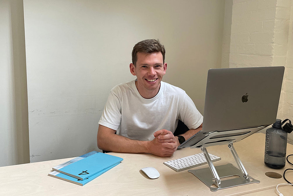
Charlie Monaghan, The Modern House
Online estate agency The Modern House specialises in design-led, modernist homes. Its carefully curated listings are as popular among design enthusiasts as it is among house buyers.
Last year they launched a print magazine, emphasising their editorial approach. Charlie Monaghan has worked with the agency since 2018 and, as Head of Editorial and Brand, oversees the magazine. This week the fourth edition is published, with an ambitious, broader distribution planned. Charlie shares the background to the project.
What are you up to this morning?
I’m starting my week at our offices in Southwark. Until recently, I was convinced that the pandemic and the flexibility it brought meant I was enterally liberated from getting in for 9am on a Monday morning. But I find now that starting the week around people and in a place that isn’t my home adds structure to following days, and it’s nice to demarcate the weekend from working life with a day at the office.
I still like working from home, though. I live alone so it’s a very quiet space that allows me to concentrate. I work remotely about three days a week.

Describe your desk and your work space.
Our offices are housed in a former ecclesiastical building which was expertly converted by local architects TDO—they are literally around the corner from us.

Their design celebrates the original fabric of the 1930s church hall, which has double-height ceilings, clerestory windows, parquet flooring and even some original religious details. We added bespoke furniture by Max Lamb and Faye Toogood, hanging plants to help with the acoustics and artwork from clients of ours.

It’s pretty clean and minimal, as you might expect from The Modern House, but that suits me perfectly!

Which magazine do you first remember?
I didn’t really grow up around magazines, at least none that made a significant impression. As an adult, discovering Monocle was very formative. It delivered everything a magazine should: it transported you, inspired you, encouraged engagement with the world. Interning there and then getting my first serious job after university was so formative.

Which magazine matters to you the most this morning?
Recently, I have discovered Neptune, which I love. It taps into what’s going on in interiors at the moment beautifully. It’s sort of cool classicism. Trad without being heavy.

Describe The Modern House magazine in three words.
Estate agent’s brochure. Only kidding!
Modern, human, friendly.

The company already has a strong, established web presence—why launch a print magazine?
Magazines are embedded into the history of The Modern House. Both our founders worked as design journalists before setting up the company, Albert at Wallpaper* and Matt at The World of Interiors.

When they set up the agency, their idea was to apply an editorial approach to selling houses, commissioning serious photographers and doing proper write-ups that were well researched. Doing a magazine came very naturally out of the success of the online editorial content that’s always been key to the brand.

Our first issue came out in September 2020 after being stalled by the pandemic, and we’ve just published issue four, which is the first to be distributed in the UK and internationally, which is really exciting for us.

Our magazine has enriched our storytelling and visual identity with art direction and photography projects that are better suited to print. Digital publishing is a lot more atomised in that people tend to see stories in isolation, but you have to think about a magazine holistically, because people experience it like that. I think our community has appreciated us taking them into our world in that way.

Has the presence of the magazine influenced or changed the website content?
We share some of the stories digitally but there are some that you just need to see on a printed page so we keep them offline.

How has the magazine developed since launch?
Because we made most of issue one during the pandemic, we were pretty restricted in terms of the stories we could commission. The following issues have been much more global in their outlooks, with features in Japan, Tibet, Australia, Mexico, USA and more.
Our art directors, Studio Small, have also really pushed the visual direction, organising special portfolio projects with amazing image-makers and photographers. Overall I think the magazine has grown in confidence and scope with every issue, so that hopefully our audience feels like there is something new to discover every time.
How do you measure the success of the magazine?
Through sales, advertising, new customers and brand awareness. Magazine publishing will never rival our core business of estate agency, but it’s important that the magazine makes money and reaches relevant and new audiences. We’re also really excited by the brands who align themselves with ours by advertising in the magazine so that’s a marker of success for us too.
Please share one piece of advice for somebody wanting to launch their own publication.
The best magazines are the ones that have a strong beat running through them, but leave enough space to surprise their readers every issue. Really drill down into what you’re about, what you want to say, what your world is, but keep it fresh.
Be specific without being repetitive—the world changes, and magazines should reflect that.
What are you most looking forward to this coming week?
We have an editorial meeting to plan out the stories for the autumn/winter issue. What could be more exciting than that?!


