The Fence #11
Our latest Page 23 sits inside the eleventh issue of The Fence, a magazine we’ve supported since it began, yet still struggle to define.
Cheekily subtitled ‘The UK’s only magazine’, the cover gives little away and the stories inside are introduced with the minimum of fuss. You have to dive in and read it to get it. At which point you realise there’s a powerful editorial thread of political and cultural gossip running through its pages. It seems very simple: an A4 format, standard paper stock, black and red colour scheme, cartoonish illustration… yet that simplicity is deceptive.
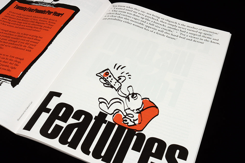
Page 23 demonstrates how magazine-savvy its makers are. One of several section title pages in the issue, it announces the Features section. Giving entire pages over to an opener in this way is a common technique (see The Gentlewoman, Port…) that reinforces structure for the production team and reader alike.

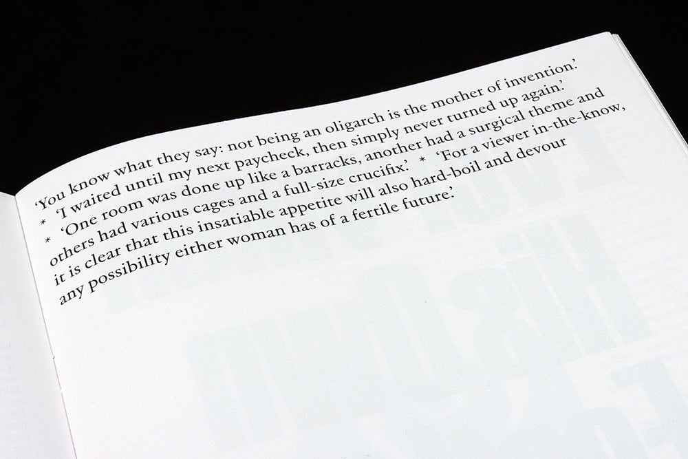
The Fence has several title pages like this, each with a mini-contents list (above) that serves a function but also allows the magazine to express personality. Our Page 23 shows how a list can tease and hint as well as explain. It oozes character whilst maintaining the slight opacity the entire magazine relies on to intrigue. Read it!
Editor Charles Baker
Art direction Studio Mathias Clottu


