

David Lane, Frieze
David Lane is the London-based creative director best-known to magCulture readers as co-founder of The Gourmand. We catch up with him this week as his redesign of another major independent, art mag Frieze, is launched.
Tell us about your journey to work.
I live close to my studio and to the Frieze office, both are a short walk. One along the canal past the narrow boats and the other through Shoreditch past last nights half digested kebabs.

Describe the state of your desk.
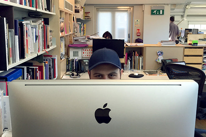
The desk in my studio is very clean, nothing on it at all except a laptop and my notebook. Its a large white table in the middle of the room. The desk at Frieze (above)is a more busy and like a tradition editorial office, be it a very light and well designed one—print outs, reference books, proofs, lists, tea cups, posits, cutting mats, iPads, all the usual accessories.
Which magazine matters to you the most right now – is there a particular magazine that’s inspiring the Frieze redesign?
Frieze itself was actually the most inspiring magazine for the redesign. There is 25 years worth of great reference material there. It’s tempting to come in and completely change everything just because you can but all the art directors have been really talented and had their reasons for doing what they did so ignoring it would be a wasted opportunity.

What have you set out to achieve with the new-look Frieze?
A few things. I worked closely with all of the editors and the wider team to define what the successes of last design were and what they thought should be developed in this redesign. There were a lot of little things that we worked on, type sizes, word counts, line lengths, the functional stuff. Then of course there was the visual character of the thing. Everyone has their own ideas of how the magazines’ personality should be represented visually and, in their own way, they are all valid.
I had very clear ideas at the start but listening to the people who know it best and work on it every day they changed quite dramatically. I think because of this the solutions we ended up with are more representative of the editorial voice. I’m not going to go in to every decision but this was definitely a project where the whole is the sum of its individually considered parts.
One of the parts is the Typeface I worked with Radim Pesko on, its a grotesk that looks, at small sizes, like a practical san serif but as you blow it up for titles and decks interesting and odd characteristics emerge. Like the Gourmand Grotesk the caps have a very different feel to the lower case so they can for fill very different roles. This is coupled with Filosofia, a typeface by Zuzana Linko from Emigre who designed the font used for the original Frieze logo. Its based on the smaller metal type sizes of Bodoni and has a much more interesting and fitting personality than the digital, high contrast Bodonis were used to seeing in fashion. I love it and it was nice to use an Emigre typeface. I feel they have been a bit left behind as type design has moved on and they are so complete and well designed.
What have you learned from Frieze that you will apply to the next Gourmand?
The next issue of The Gourmand is nearly ready and will be released in just over a month. We have some amazing features, I would go as far as to say its the biggest and best yet. I wish I could tell you about it now but you’ll have to wait—sorry. In terms of lessons I’ll bring from Frieze I think it’s going to simply be to enjoy the luxury of time. At Frieze a small team turns out a really substantial and well put together magazine almost every month and the design has to reflect that, there is a lot of practicality in it. At The Gourmand we have a much longer layout period and that means each feature can be developed and sculpted to give it its own voice. It’s a real luxury and one that every time I work on another, more frequent publication, I appreciate that bit more.


Pick a spread from the new issue and tell us what it says about the redesign of Frieze.
As the magazine is in four quite distinct sections; columns, features, reviews, and listings its really hard to pick just one spread. A substantial part of the design was to give each of these a clearer and more practical visual language. Columns have become more newsy, features more in-depth, multilayered and image led and reviews and listings simpler and more practical. One of each attached below.
What are you finding most frustrating about your work this week?
Just the usual plate spinning. Because I do quite a diverse range of work; The Gourmand, Frieze, my studio projects at Lane & Associates and e-films I’m makinge, and each have their own time tables, it can be quite frantic. I work with great, organised people across the board so its always managed well and works out in the end but when your in the midst of one magazine redesign, another on layout, a film in production, a book going off to print and a handful of studio projects it can get a bit overwhelming.
What's going to be the highlight of this week for you?
At the end of the week I’m off to Paris to shoot a really exciting project for Hermès and before I go I’m going to nail the cover for next issue of The Gourmand and hopefully Frieze too. Thats the plan anyway.
What will you be doing after this chat?
Going to the dentist.
David Lane is among the speakers at ‘Graphic Design for Art,’ an upcoming Frieze Academy event.