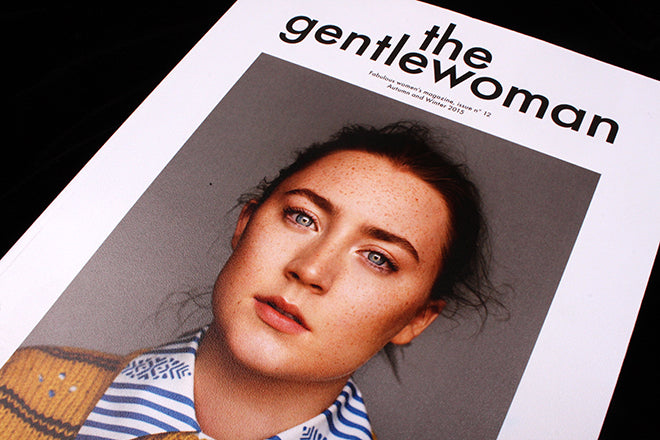
The Gentlewoman #12
In the first of a new series of posts examining elements of magazine design in tight close-up, we look at the flatplanning of the latest issue of The Gentlewoman.
We love introducing new magazines here on the Journal, and there’s no sign of a slowdown in supply from the indie world, but it’s also important to keep an eye on the more established titles.
Regular readers will already know The Gentlewoman but in case you’ve somehow missed it so far… I’m not even going to go there. If you love magazines and don’t know this one, where have you been?
This week the twelfth issue of the women’s biannual is published, and for those that do know it, it’s very much business as usual. Such is the problem of high standards – how do you better things issue to issue? Another stunning cover shot by Alasdair McLellan of a carefully selected subject, backed up by a strong set of profile features and beautiful paper and production and regular splashes of Futura. The fashion stories have developed a more commercial edge, but that doesn’t blunt the overall impression of sheer magazine craft at work here.
One of the easily overlooked part of putting together a magazine is the flatplanning. Often this is left as an invisible part of the process, something to help the magazine team pull the content together, but hidden from the reader.
 Like it’s brother Fantastic Man, The Gentlewoman likes to define its sections and departments very clearly, with full-page section openers labelled Parts One, Two and on. This simple structural device has developed into a design highlight of each issue, and in this latest one the openers use a coarse halftone dotscreen that is hugely satisfying (above, below).
 At complete variance with the smooth printing elsewhere (below, the cover feature), these pages introduce a zine-ish touch to the pages.
 The same effect is applied to the References pages at the end of each feature; here the large dots flow across more detailed images to great effect (below). Just as the References themselves remind us of detail, this visual effect is a reminder of the process behind making the magazine.

The presence of these Reference pages is a bold editorial statement, allowing extended information to be shared while also serving up the understated irony that is such a vital part the magazine’s tone; their presentation furthers this, adding graphic punctuation to the flow of pages. That the pages come in pairs too, one ending the previous feature the other ahead of the next. These spreads punctuate the entire issue.
 A similarly strong control of editorial flow is applied to the fashion section. As I said, the shoots are more overtly commercial, so (perhaps) to compensate for this, the use of multiple locations is emphasised by each story being titled by place (Alexanderplatz, Fontainebleau etc) and ending with a double page visual/written description of that location alongside the shoot credits (above). What would otherwise be a series of strong fashion shoots has a new Gentlewoman-ly context.
Editor-in-chief: Penny Martin
Creative director: Jop van Bennekom
Art director: Veronica Ditting


