Elana Schlenker
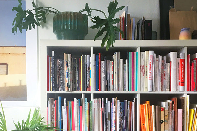
This week graphic designer Elana Schlenker, best known to magCulture readers as the mind behind typography-loving Gratuitous Type, is showing us around her magazine shelf in Brooklyn.
We asked Elana to select three issues for us: a new issue, an old issue and a detail that she thinks is especially great.
An old issue: Nest
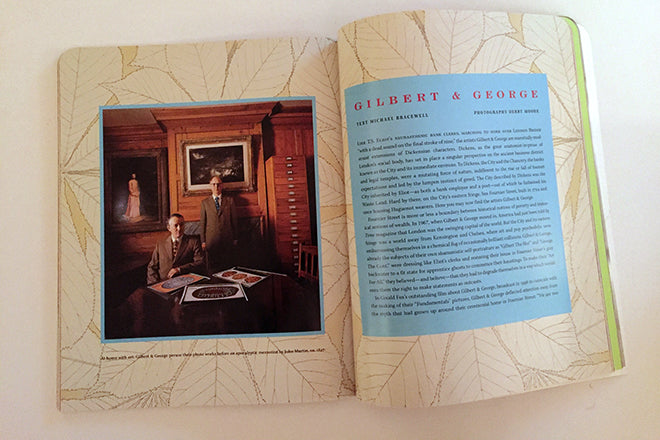
Last year, a friend turned me on to Nest, an interior magazine published from the late 90s to early 00s. The bold design, unusual production details, and hilarious content make for fabulous inspiration.
It's probably cheating to cite Wikipedia, but it sums things up so well: ‘During its run, Nest showed the room of a 40-year-old diaper lover, the lair of an Indonesian bird that decorates with coloured stones and vomit, the final resting place of Napoleon’s penis, the quarters of Navy seamen, a barbed-wire-trimmed bed that doubled as a tank, and a Gothic Christmas card from filmmaker John Waters.’
A new issue: Buffalo Zine No.3
Always working slightly against the grain of publishing trends, Adrian Gonzalez-Cohen and David Uzquiza's Buffalo Zine is a publication I've loved from the start. But wow, this latest issue is a knock out!
It's a large format hard cover in the spirit of Self Service, with whimsical, storybook influences, expressive type, and a healthy dose of cat content. It's funny, fearless, stylish, and surprising – a real antidote to the minimal aesthetic that has permeated so much of contemporary independent magazine design in the last few years. It reminds me of Sol LeWitt's classic advice, ‘Don't worry about cool, make your own uncool.’ I just love it.
And another thing: Lula spines
I considered turning in a list of a dozen another things, but I'll play by the rules despite the fact that narrowing down has been purely torturous: The necklaces on Lula’s spines always make me smile. It’s such a pretty little detail, and they sit on a shelf opposite my desk right at eye level, so they make me smile a lot.


