

February 2016
We don’t promise to cover everything we get sent to review, but there are always some magazines we can’t quite squeeze into our weekly schedule that deserve a mention. Here are 14 from the last month, including magazines about surfing, art movements and paradise.
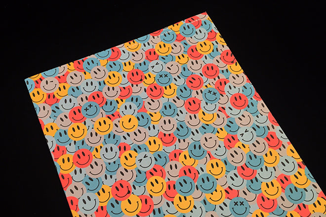
Print Isn’t Dead #4
After the monochrome print experiment of cover three, the vivid smileys of the latest cover (above, by Jon Bland) stand out a mile. Inside, it’s another trawl through the work of various designers, illustrators and publishers including some of the big fish in the London design sea: Marion Deuchars, George Hardie, Alan Kitching and Ian Wright all feature. Although always visually arresting, I retain a nagging doubt over a collective lack of opinion in the publication.
printisntdeadmag.co

Odd One Out #2
Malasia’s Odd One Out tells the stories of people who break with conventions. The editorial design chimes with the indie-mag vernacular we’ve all come to know, but as editor Hamizah Adenan told us in our At Work With interview last May, this decision was very deliberate: “I wanted to blur the lines between different countries and eliminate any preconceived ideas that people would normally get when they hear ‘Malaysians’.” The Apartemento-meets-Benji Newman layout is a beautiful, crisp package for the Malaysia-based stories inside, and volume 2’s attention to illustration is particularly note-worthy.
oddoneoutmag.com

Somesuch Stories #1
Pocket-sized Somesuch Stories is a project started by a London-based film production company of the same name, and as well as this tiny, silhouette-filled publication, they’ve created a digital platform for showcasing contemporary writers. The magazine itself is a mini-collection of essays and short stories that explore culture, nature, sex and society, and it’s designed and printed by Risograph at Ditto Press.
somesuchstories.co

Teeth #2
Biannual Teeth is a new fashion, photography, music, culture and art publication that aims to be treated as a coffee table book just as much as a magazine. Designed by London design studio She Was Only (the team behind Boat’s Tel Aviv issue), the second issue is already available in WHSmith Travel and in large chains like Harrods and Barnes & Noble.
teethmag.net

Union #2
This British magazine brings an eclectic mix of journalism and photo-reportage; learn how Nottingham became the centre of UK breakdancing, visit Black Bike Week, read an interview with US comedian Ms. Pat. All interesting subjects in their own right, but hard to hang together to make a cohesive whole and even harder to define neatly in a mini-review like this. The design faces a similar dilemma, avoiding indie mag clichés while never quite establishing its own tone of voice. One to watch.
unionmag.co.uk

Wayward Arts
Each month Canadian printers Flash Reproductions partner with a local design studio to produce a new issue of Wayward Arts. Their most recent issue invited Re:form to explore the theme of ‘counter-culture’, and the studio’s response was highly photographic. It’s a world apart from last issue’s Bauhaus coloured interpretation by Blok Design, yet again demonstrating the wide-ranging nature of the project.
waywardarts.ca

The Sunday Times Magazine redesign
The recent relaunch of this venerable newspaper supplement could have been so exciting; a strong creative team led by art director Matt Curtis and backed up by external support from Simon Esterson means the design is sound, but the content is disappointingly vanilla. We are not living in the sixties, when a weekly colour magazine was a revolution in itself, but the celebrity features and car reviews give this an over-familiar, tired feel from the start.
thesundaytimes.co.uk/sto/Magazine

Structo #15
I’ve always loved the covers of UK-based literary magazine Structo –specifically the use of photography and the way it juxtaposes with the classic bird emblem. An interview with ex-poet laureate of North Korea, Jang Jin-Sung, makes this new issue particularly special.
structomagazine.co.uk

AM21
This German university project is published annually by the graphic design course at Akademische Mitteilugen, Stuttgart. This issue, the 21st year of the project, is themed Pieces of Paradise and is a lushly produced large-format publication featuring different papers, gold ink and a crisp modern design aesthetic. Largely in German, it’s hard to decipher detail; but the cover does bother me, with its retouched butt wearing a bikini paradise. An equvalent male image inside the mag is far less sexualised.
thepicta.com/user/akademischemitteilungen/1900889501

Save Our Souls #1
Here’s a new comic magazine from the UK edited by graphic journalist David Ziggy Greene, known for his satirical work for Private Eye. The illustration styles featured inside are more scrappy and cartoon-y than what you might find in something like Off Lifeor Lowbrow – this is the magazine for political cartoon-enthusiasts and comic readers that browse the downstairs aisles of GOSH Comics in London. As it features work by the likes of Eleanor Davis too, Save Our Souls might also appeal to fans of the bold and colourful contemporary illustration scene.
indiegogo.com/projects/save-our-souls--2#/
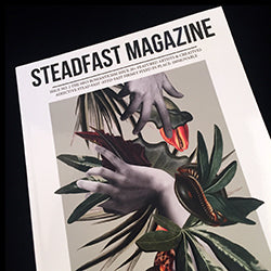
Steadfast #2
I like the idea behind Steadfast a lot, and I’m surprised that it hasn’t been done yet – each issue looks closely at a different contemporary art movement. We’ve discussed the prevalence of what we call ‘Platform magazines’ on the Journal before, and I find that Steadfast takes the idea of a magazine-as-showcase to another dimension and gives it more depth. This Neo-Romanticism issue features the work of 20 artists and image-makers who reject realism in favour of poetic nostalgia and the imagination. The cover collage by graphic artists Roze Hooij is particularly seductive.
steadfastarte.com/current-issue-1/

Acid #4
Always a lively magazine, this latest issue of the French-published English language surf mag doesn’t disappoint. Energetic typography and clashes between cramped text and wide open space echo the sport, and action photography, illustration and still-lifes mingle at a chaotic pace. A perfect reflection of its subject matter.
acidsurfing.com

Shot of Joy #issue 1
Dutch Shot of Joy expressly emphasises in its editor’s letter that it’s run by a group of women that used to work for professional glossies but who have decided to start up their own independent. Reading through the extensive team list is quite surprising – the editorial staff of 11 is entirely made up by journalists for Vogue, Marie Claire and Cosmopolitan.
It’s difficult to tell whether Shot of Joy is aiming for the heights of these old-school glossies or not: while the aesthetic is more relaxed and in line with what you might find in indies, the topics covered still centre on Cosmo themes like shopping, beauty and cocktails. But the way these topics are discussed doesn’t have that same glitzy or patronizing tone – these editors have either had enough of their current clients, or the approach and sensibility of indie titles is really beginning to bleed into – or combine with – titles that in previous years would have felt more traditionally mainstream.
shotofjoy.nl

Cakeboy #2
LGBT Cakeboy is a photozine from Brookyn – its showcased work is more gritty and grungy than the sleek work you might find in more well-known queer mags like Gayletter or Hello Mr. According to the editors, the vibrant publication is a “disco-dancing, Oscar Wide reading, Streisand ticket-holding friend of Dorothy.”
cakeboymag.com