Elisa Medde, Foam magazine
Amsterdam-based Elisa Medde is a photography editor and curator who has worked for cultural institutions, publishing houses and non-profit organisations. Since 2012 she has been managing editor of photography magazine, Foam. We speak to her as issue 53 of the magazine is published, the fashion-focused ‘Adorned’ edition.
Tell us about your typical Monday journey to work
I am not exactly a morning person, and I have two kids, so Mondays can be intense! Our (mine and my partner’s) routine revolves pretty much all around them - wake up, breakfast, getting ready. I am normally in charge of the little one, who is one year old and goes to day care very close to Foam. So me and him bike or ride the subway together, and right after I leave him at his playgroup I run to work - because I am always late! There’s obviously also a lot of coffee involved.
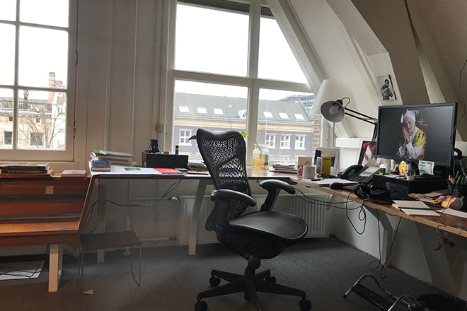
Describe the state of your desk and what you can see in your office
Thankfully we do not have a clear desk policy! Depending on the stage of magazine production you would most likely see piles of books/magazines, mood boards, piles of documents to check/proofread, post-it everywhere and empty coffee cups. Oh, and lots of plants! But after each issue goes to press I love having a Marie Kondo moment, everything gets neat and tidy - ready for the next ride.
Which magazine do you first remember?
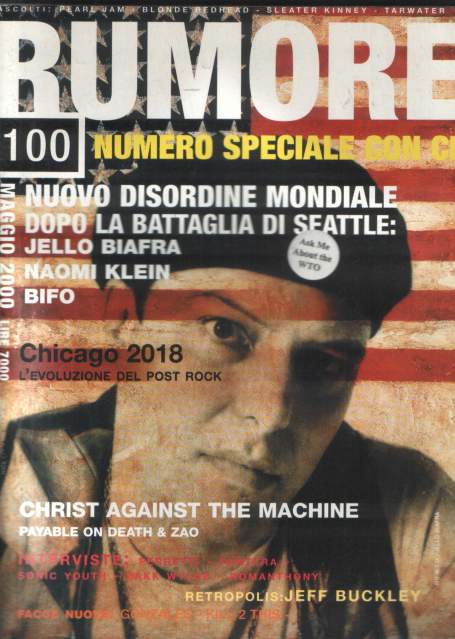
When I was a kid one of my aunts gave me as a birthday present a subscription to Mickey Mouse (Topolino in Italian) - I still remember the joy of that weekly delivery. I also have a sweet memory for La Settimana Enigmistica, an Italian enigma and crosswords weekly my grandfather would focus on every day after lunch. Growing up as a teen, I loved National Geographic and Rumore – an Italian music magazine.
Which magazine matters to you the most right now?
I am a hopeless case of magazinitis: I love magazines, I collect them, and I am always on the hunt for something new. There is a fantastic bookshop in Amsterdam called Athenaeum Boekhandel that has an incredible section all devoted to magazines, mainly independent ones – a true Valhalla.
My long time favourite magazine is The Plant: a beautiful publication that combines my biggest obsessions – plants and photography.
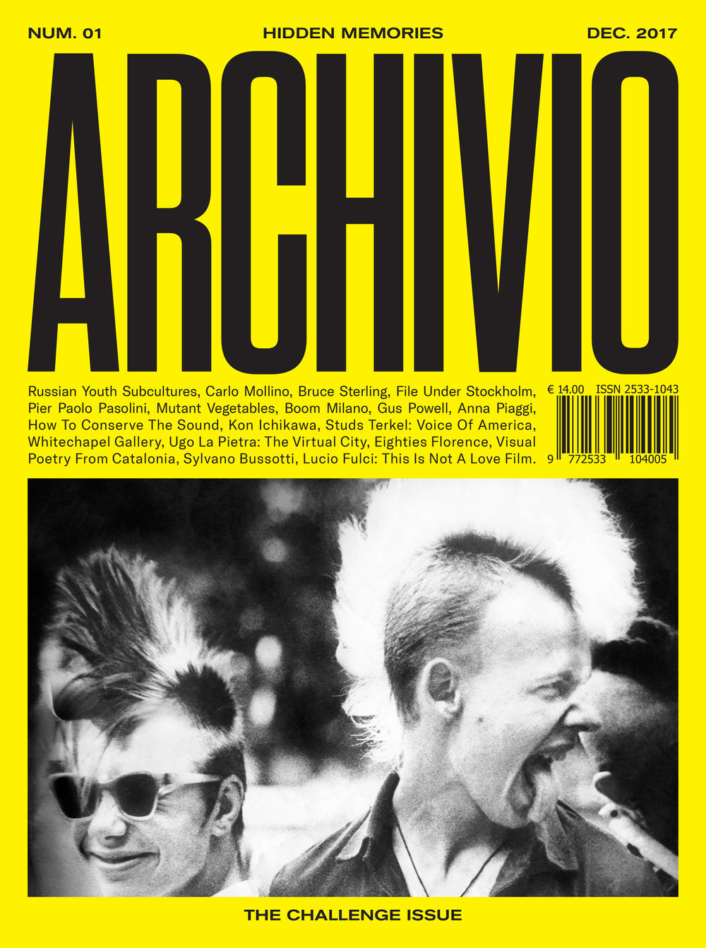
Most recently I fell in love with Archivio, a magazine focusing on the archives, and Cold Cuts, a magazine about queer culture and the Middle East. All of them have an amazing use of photography, and very inspiring content.
Can you describe your magazine in three words?
This is complicated. I would say timeless, bold and inspiring - or at least this is how I hope people feel about it.
Your format is pretty unique – multiple portfolios printed on different kinds of paper, 2-300 pages – resulting in a very noticeable spine. Can you tell us a bit more about that?
Each issue has 288 pages, made of a range between 10 and 12 different types of paper including the cover. Its binding is important, indeed, and it’s an identity mark. It comes from the necessity to use 100% of the paper surface, making sure pages lay flat when open.
Technically speaking it is not bound, also because we do not have a cover that wraps around: the spine is called open bind, obtained by stitching together all the booklets, with the cover being treated as such. The design of Foam is of course one of its most important aspects. I am very thankful to be able to work with some of the best, now since long time: Hamid Sallali, an independent designer who leads the design of the magazine, and Ayumi Higuchi. They are the ones making the magic visible.
How do you pick the theme for each issue and what’s the process for gathering content?
The magazine is the portable exhibition platform of Foam. Since issue three, it is not related to the museum’s exhibition program, with the editorial team and the exhibition department working independently. This said, we constantly share ideas and materials, and cross pollinate each others.
Sometimes we do work together on special projects: for example the annual Talent show, stemming from the yearly Talent Issue of the Magazine, or with Foam #49, Back to the Future, complementing a fantastic exhibition project curated by Kim Knoppers. The exhibition opening, in 2017, coincided with the magazine launch and it was beautiful to experience two complementary takes on the same subject.
This said, themes are picked following a very instinctive process. They need to be broad enough to be looked at from different points of view, but they also be able to grow over time. They need to be timely, carry a certain sense of urgency too. Over all, they need to spark our curiosity, trigger a need to dig deeper. Possible themes are something that always brews in the back of our minds - and sometimes they are even triggered by specific bodies of work. There is no fixed recipe, really.

Two spreads from the latest issue of Foam, no53, Adorned
What do you love most about photography?
I have a rather classic background in western art history, firmly rooted in iconology, but photography has always occupied a very special place in me. On a very instinctive level, I love the magic it sparks – I have a visual adoration for the photographic image. On a more rational level, it would be the communicative power – be it with a single image or a series. The ability to bring different and new elements to the table – or create brand new tables.
Amsterdam has a thriving indie mag scene – why do you think that is?
Amsterdam, and the Netherlands in general have a great history in print-making and an equally founding tradition in graphic design and typography. It’s a domain that has always been fertile, and one in which the Dutch still put a lot of effort education - wise. So this definitely contributes in making the difference.
That said, the Dutch in general still consider as highly important a certain idea of leisure and slowness that creates a very good brewing ground for magazines. Oftentimes a good visualisation of an Amsterdammer relaxing is someone sitting on a couch, or on the house doorsteps, with a coffee/drink in one hand and a magazine in the other. It’s a very nice national vibe.
What’s going to be the highlight of the week for you?
We are about to launch our spring issue, and I am very excited about it! Meanwhile, we need to start getting deeper with the next. It’s a precious week of celebration of a cycle that we just completed, and the start of a next one.
What are you doing after this chat?
Going down to the kitchen to make myself some coffee!


