Fruitlands #2
I first heard the seed of the idea that would bloom into Fruitlands zine when I was completing my art history MA at the Courtauld Institute last year. I worked at the desk of an image library with a fellow student called Phoebe Lindsley: she’d spend her shift dreaming up ideas for a publication and was always dressed in immaculate double denim ensembles.
She also seemed to be continually writing papers on the influential Black Mountain College experimental school in North Carolina. One day Phoebe became especially fascinated by the historical ‘living experiment’ Fruitlands community in Harvard, Massachusetts – an ultimately unsuccessful agrarian commune set up in 1840 that was based on Transcendentalist principles and an intense utopian aim to live in harmony with the universe.
To bring the zine to fruition, named after the community experiment, Phoebe joined forces with Naomi Pallas, another Courtauld student who was writing predominantly on contemporary art and whose pink and silver wardrobe alongside Phoebe made the pair look like the girls from Lush or maybe a sci fi Spice Girls. The two art history students released the first ‘America’ issue of Fruitlands just before graduating – the title brings together their enthusiasm for 90s girl-bands, Hollywood tackiness, contemporary art and also theoretical thinking, connected in energy to the doomed but passionate Fruitland spirit.
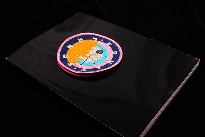
Issue two of Fruitlands is more magazine-like than the first – it’s perfect bound and comes with its own freebie patch that you can iron onto your own carefully coordinated double denim. The patch sits enticingly against the high-gloss black cover. The issue’s theme is ‘Space’ so it’s filled with oozing typography (above) a confusing, star-shaped contents page (also above) and playful layouts of text (below).
The spatial and occasionally space aged theme gets interpreted in a variety of ways by the contributors. Writer and Dazed & Confused deputy editor Claire Healy explores the strange inbetweeness of shopping mall culture in a way that reminds me of Rem Koolhaas’ seminal essay on architectural ‘Junkspace’ but also of the mall scenes in contemporary fiction writer Natasha Stagg’s novel Surveys. Silent analogue photos by Lewis Wynn add to the strange atmosphere conjured by the piece (above). Amrou Al-Hadhi writes on the consequences of the diminishing number of physical queer spaces in London, and Luca Picardi’s photographs ask whether there’s room left for those who aren’t elite in a time when Heygate Estate is transforming into Elephant Park (below).
Editor Naomi’s essay investigates how imagery from the Hubble Space Telescope is being used by contemporary artists (above), and an article by Phoebe considers the idea of conspiracy and the myth of Planet X (below).
The title’s fashion shoots relish in their amateurism much like Cheap Date once did – I’m still unsure what I think of the ‘Space Girl’ shoot that consists of a mop, a giant glittery ball, a sand pit and a model leaning on a synthetic rock like a intergalactic mermaid (above). Lauren Doughty’s illustrations for a horoscope at the back of the title make especially good use of this deliberately scrappy and lo-fi aesthetic (below).
Much in the same way that there’s an endless stream of magazines being produced in the capital at the moment, London is also a hot spot when it comes to the new outpouring of contemporary zines. Current economic and political disarray means that we’re seeing more and recent graduates producing new titles with an idealistic social and satirical bent, and Fruitlands should be seen as part of this.
Magazine readers are currently very excited by Mushpit, another example of a title that’s emerged as a result of this energy and dissatisfaction, and which makes strong use of satirical photography and graphic design to reflect and confront the UK’s turbulent moods. But in-depth, biting yet approachable analytical critical writing is lacking from its contents.
While Fruitlands’ design could (and no doubt will) refine as it grows, the way that the tongue-and-cheek and deliberately tacky energy is contextualized and juxtaposed with provocative art and theory writing is vital and necessary, so it all doesn’t slip into the merely flippant.


