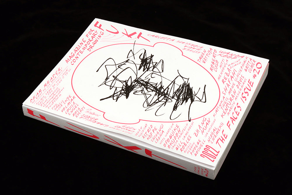
Fukt #20, Faces
Magazines and faces have been tightly entwined since the 1950s, when it was first appreciated that a life-size human face was the perfect image to attract the reader to your magazine.

A quick look around our shop shows how many magazines still use faces, and resulting eye contact, to appeal. Check this weeks window, where we’ve used a set of faces to welcome customers to post-mask life (above).
The same point is made in the introduction to the new issue of Fukt, the magazine for contemporary drawing; ‘Many of us long to see the whole face again, give a smile to a stranger, engage in conversations with mouths uncovered.’ Indeed!

Fukt always presents a delightful variety of images along a theme, but the latest one, Faces, is particularly specific and powerful. Flicking through the new issue is a reminder of our busy pre-Covid lives: its pages are crowded with faces, eyes stare out at us, look upwards, sideways… and are rendered using pencil, paint, card, and even on pottery.

The 226 pages present a glorious mix of drawing styles—and therein lies the key difference with the familiar visual language of magazines. Magazines rely on faces but invariably those faces are photographed. The multiple renditions here of faces of all types is a joy to sample.

The exceptions to the drawn face are a couple of examples of photographs of faces that have been drawn on, one of which (above, below) shows a series of experiments designed to confuse AI face recognition systems.

While most of the issue reproduces submitted artworks, this is one of several written stories that examine our relationship with and interaction with faces. Another piece looks at the craft of the court artist, recording trials in a camera-free environment.

Alongside all the faces there are artist interviews and other smaller articles, all adding an undercurrent of weight to the issue. These are tucked in between the face images, often hand-written, and carefully presented to be legible without overwhelming the imagery. The result is more sketchbook than taxonomy; the issue encourages repeat flicking as you discover new stories and characters every visit.

Fukt has made a feature of its cover in recent issues, using production techniques to enhance the experience of interacting with a printed magazine. This time the cover consists of a simple outline face for the reader to draw their own image (above); we are encouraged to share the results with the publisher.
Clever though that idea is, as a cover, a blank face alone would make for a disappointing design. To counteract this, each issue has a single sheet attached over the cover, repeating the design but adding a drawn face to the template.

There are 24 different options to choose from (seven shown above), and together they are a feature in their own right, subtly parodying the way magazines use faces on their covers.

Take your pick, then peel off the face and add your own (below).

Fukt is always beautifully curated and presented, but what really impresses me is the way the collected art is genuinely fascinating and varied, the mix of written stories broadens the theme usefully, and the cover concept reminds us why print is so engaging. It is hard to propose a way to improve the end result, and for that reason it is our latest Magazine of the Month.
Editor Björn Hegardt
Designer Ariane Spanier


