Grow #3
We don’t see many magazines about science, so when one as well-produced as Grow turns up it deserves some attention.
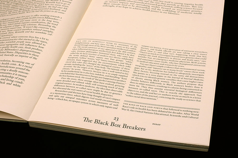
Presenting cutting-edge stories around synthetic biology—the idea that we might program cells as easily as we program computers—Grow is put together by online platform Massive Science on behalf of Gingko Bioworks, specialists in this rapidly developing area of research. We’ve zeroed on on page 23 of the new issue to highlight how playful design can reflect the nature of the broader story being told.
So much science coverage suffers from an outdated belief in the need to separate science and art, as if creative art direction and design will demean rational analysis. That needn’t be the case, of course, as our recent interview with the publishers of data viz mag Market Cafe Magazine hinted.
Grow makes an even stronger case against the separation of disciplines. If the first two issues of this US magazine were beautifully produced pieces of art direction, this third issue sees the design match the ambition behind the stories and artwork.
Page 23 highlights just that. Designer Chloe Scheffe repurposes a familiar set of design and grid elements to establish a new system. Using her knowledge and experience, she moves the basic page system beyond workaday—breaking the rules to turn expectations on their head while keeping the page functioning.
Page numbers, running heads and subject tags are elements common to most magazines, vital devices used to help the reader navigate. Here, they are the single common factor throughtout the issue, but positioned at the bottom of the page not the top (see video above).
The rest of the page is very classical in presentation—Scheffe applies absolute attention to every detail, the result being a modern classicism notable for its restraint. The type size, linespacing, page margins and use of spacing, parallel rules and small caps for section intros are all very exact.
As is the positioning of those page numbers, running heads and subject tags. Other parts of the page shift about from story to story: column widths vary, intro text jumps up in size, headlines use large, raw handpainted characters.
By contrast, the navigation elements need a regular, quickly familiar identity to function properly. Which they do—but that doesn’t mean they need always be at the top of the page.
The result is a magazine that challenges expectations while not breaking the magazine’s core functionality.
Executive editor: Christina Agapakis
Art directors: Grace Chung & Livia Foldes
Designer: Chloe Scheffe


