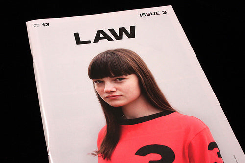
Magazine of the week: Law #3

This is the third issue of London-based LAW, but the first I’ve seen and I’m already excited to see the first two issues. The limited edition (x500) magazine is edited by John Holt, who describes it as being ‘for those who can appreciate and relate to the stylistic value of real everyday Britain.’
LAW stands for Living and Working, and the magazine is a collaboration between a close group of contributors with expertise in photography, film-making, typography and graphic design. They share a united vision of current British youth culture, and regardless how ‘real’ that vision is – I do wonder how idealised it is – the result is a convincingly told story. It successfully uses strong editorial technique to take a contemporary look at the intersection between working class youth and fashion.
 The issue includes an interview with young tailor Nick Tentis (above), a profile of British knitwear brand John Smedley (below) and (further down) an interview with youth culture observer Paulo Hewitt.

But what’s particularly exciting to me is the way the content and design seamlessly combine to create a beautifully paced, no-nonsense adrenalin rush of image and text. Scattered through the issue are single-page taxonomy-style grids of objects – high street plastic bags (above) and wheel hubs (below) are joined elsewhere by vinyl record labels and middle-of-nowhere A-road signs as records of the mundane. These are not glamourous or sought-after brand items, but the slightly dull repetitions of daily life… mobiles, mastiff dogs, amateur football.


The magazine is split between white gloss paper (mainly carrying the images) and matt pages, printed red with the headlines split across pages behind the copy (above). The low print run allows these two stocks to be spread through the issue giving a pleasing pace to the run of pages and content. Each each so far has used different typefaces – check the webiste to see the previous issues.

LAW takes the basics of editorial design and uses them to great effect: gloss v matt, text v image, red v white, colour v black and white. Apparently simple, then, but every now then there are surprises thrown in – such as three brief pieces of poetry (below).

There’s plenty more to enjoy in the issue, I recommend you get hold of a copy soon.

This magazine is now available from the magCulture shop.


