
Nuts #1
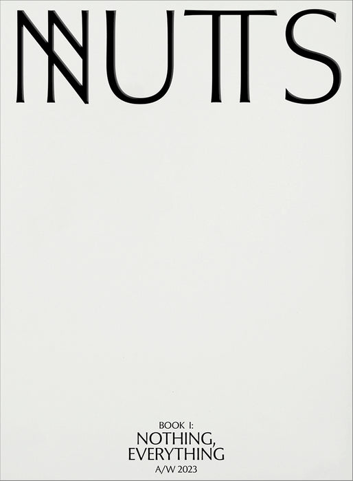
Richard Turley and his Food team are back with another piece of experimental magazine making. His latest project Nuts subverts the visual and verbal language of the fashion magazine.
Turley understands better than most creative directors that the experience of reading a magazine is a very particular one. There’s no right way to read, of course, but generally a magazine is approached as something to flick through, certainly at first. You don’t start a magazine on the first page and read methodically through to the final page—that’s for novels (and perhaps The New Yorker).

Instead, we dive in, flicking, letting ourselves be caught by a headline, image or combination of the two. The run of pages move past you like a movie—this is a time-based medium—and we learn to be adept at reading the blur as it passes. We stop here, there, we flick in the other direction and back. An overall impression is gained, before we revisit some of the stories that caught our eye. A reader can feel they have ‘read’ a magazine without actually engaging indepth with any longform piece of written content. They’ve measured the balance between text and image, gauged its design language, and enjoyed the feel of the paper and the smell of the ink. And decided whether or not to dig deeper.

Nuts has been created to sate the above senses. The paper is a thin, off-white stock and the content has been printed in low-contrast black and white throughout. The combination of large pages and thin substrate highlights its physicality, and makes the magazine eminently flickable. Doing so confirms you’re experiencing a fashion magazine: there are multiple full-bleed images of young people in various situations, inside and outside. There are definitely clothes going on.

The images are interupted by the furniture of fashion: large headlines announce new ‘stories,’ all clothes are credited. Sometimes the two are confused—are the words above and below slogans or credits? There’s humour here, so no surprise to see Bertie Brands, late of Mushpit, involved.

Yet stop for a moment… little of what we’re reading makes sense in a fashion context. This is not the usual bold hype of fashion confidence, it’s existential angst. Many of the headlines are almost ‘right,’ but just fall short, a clever positioning since so much real fashion content is one remove from this. Other headlines are scored out. Neither parody nor pastiche, this is critique.

It’s a brilliant sleight of hand: a fashion mag that isn’t a fashion mag. For both its physicality and its abstract conceptualism, it sits well next to Turley’s last self-published project, Civilization. And both are interesting contrasts to his earlier editorial work.
As we prepare this year’s magCulture Live event, I’ve been looking back at the first edition, ten years ago. Richard Turley spoke there about his work on Bloomberg Businessweek, the magazine that made his reputation. He was speaking toward the end of his time at the magazine, and he was clearly frustrated with it.


What made BBW such a compelling project was the way Turley established a solid framework to rebel against. A weekly magazine needs structure, but using typography, illustration and hand drawn elements, Turley regularly attacked and broke his own structure. It worked brilliantly, but now he is regularly working without structure. Civilization and Nuts both appear to have grown organically, built from pure ideas rather than a grid system. Turley now has a body of people around him who can help him do that: Brandes, Echo Wu, Julia Schafer and more.
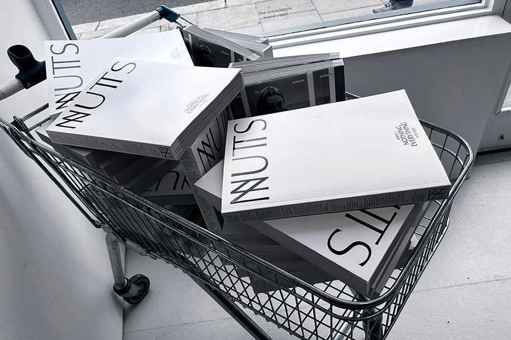
Nuts has been launched as if it’s a fashion magazine. A party in New York, a gallery show and lunch in London (thank you!), something in Milan. The picture at the top of this post is from the London launch, a knowing reference to the commerciality of fashion, even as the magazine’s website offers ‘Integrations’ in the hope of joining the brand bandwagon.
Buy your copy from the magCulture Shop


