


Mushpit #10
Next week sees the launch of the tenth issue of Mushpit, with a very different look. Editors Charlotte Roberts and Bertie Brandes have teamed up with design titan Richard Turley in one of the most exciting collaborations of the year; the result is editorial design at its most emotive and special. We talked to the trio ahead of publication, but first some thoughts on the issue.
It’s fascinating how Mushpit has developed from zine to bigger, glossier magazine format. I was intrigued from the moment I saw issue seven; then I met Char and Bertie and was hooked – their mutual chemistry was the living personification of the magazine. Following issues sharpened their wit further, retaining the slightly self-conscious anti-design feel as they employed multiple visual references and cues to parody advertising and other media. It was irresistable: at once hilarious and serious while always 100% on target against their chosen bogeymen (and it was, generally, men)
The tenth issue ups the ante and sees the magazine leap ahead of itself, striding beyond cautious parody and establishing its own rules. Adding Turley to the mix was bound to shake things up but this is an earthquake. Earlier issues pale in comparison, as he applies his spare but thrilling graphic touches and establishes the confident visual identity Mushpit has been lacking.
While part of the appeal of Mushpit was this very lack of clear visual identity, it now has a really strong design aesthetic that is familiar from the more extreme elements of Turley-era Businessweek (as well as his more recent work on Good Trouble). And that aesthetic turns out to be the perfect foil for the content.
To state the obvious, the difference between Businessweek and Mushpit is the content; this is important because here we see Turley working in sympathy with the content rather than slyly bending economic and business stories into new shapes. The design is full of quirk and character while refreshingly clean, spare and urgent– there is little on these pages that is unneccesary. If earlier issues had the muddy colour and typography of Photoshop, we now see the Mushpit world via the pin-sharp glare of InDesign.
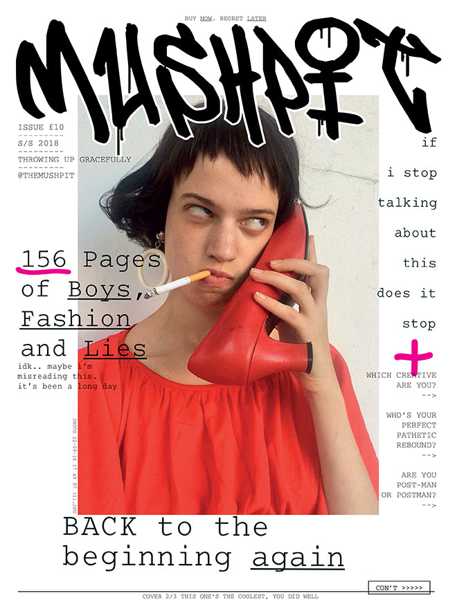
The cover (the one above is one of a choice of three) sums this up perfectly; a typically ironic Mushpit image is accompanied by the new tag logo, typewritten coverlines and handwritten details against a bright white field. It looks effortless.
Throughout, the issue is a thrilling example of the potential for design to improve content. It is editorial design at its highest level, as the familiar, clever editorial twists and turns are sent spiralling by their visualisations. The Mushpit world of boys, social media and twentysomething angst is brought to vivid life on the pages.
A valid criticism of indie mags is their reliance on a templated design approach, something that Mushpit never suffered from, but the impression of spontaneity on every page remains is enhanced by the new sophistication of the design. Char, Bertie and Richard are rightly excited by the results, and its arrival so late in the year gives us a wonderful, late Magazine of the Week to enjoy.
I spoke to the Mushpit trio about the new issue and how they came to work together.
What have you been doing – why no Mushpit for so long?
We’ve mainly been repeatedly inciting and avoiding crises, which is a constant struggle really isn’t it. Despite no official Mushpit until now we actually made four sponsored zines earlier in the year in order to rake in enough dosh to ensure this issue is madder than ever, which it definitely is. To be honest we needed all the pain and anxiety accumulated over the past 12 months to make this one as honest and brutal as we hope it is. We’re prouder of this issue than ever. Read it and weep, we did.

What happens to Mushpit while it’s dormant? Is there another outlet for your humour/anger?
Yes absolutely, we have lots of lunch break fury fags where we put the world to rights, often by teasing out each other’s ideas and feelings. Our constant conversations are the soul of every single idea that makes it into the final magazine. We bank a lot of ideas along the way and then we vomited them up all over Richard which was nice for him. Oh and memes.
Any new influences to the Just17 x Private Eye mix we already love?
Tibor Kalman and Colors which is genius. Richard’s old student magazine that we saw in his 205 page “deck” he sent us. Adverts on the tube. Boys, men, art school. Joan Didion. Darcie Wilder’s twitter. Lorna Mills - Ways of Something, the graphics in Fallout, eBay. Our constant personal failures.

What can we expect in the new issue – big changes?
YES big big changes. Fuck me it’s a good one. We literally ripped up the rule book and Richard went to town. It’s brash and messy and weirdly logical at the same time. We love it.

What’s your personal highlight from the issue?
Char: Natalia’s 3D rendering of a boy’s house is absolutely genius and so spot on. I also love the crisis pages of repeated text which really crescendo into the next section, throughout the issue there’s a real sense of acceleration and climax which I love. Darcie’s piece is heartbreakingly good and I love our covers, Lily Mcmenamy is ultimate <3

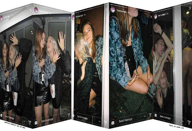
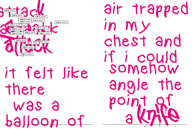
Richard: There’s a section in the middle that begins with a break up piece entitled "You kick flipped my heart", that leads into pictures of a young woman applying make-up before a night out (above), to a story about waking up on the floor at a stranger’s house, to an objectified male model, a panic attack, the phrases ‘don't worry’ and ‘you had me’ over and over (below). None of these parts are really related, or explainable, but I love the way this sequence spirals and cross-refers, never quite explaining itself - you feel it rather than understanding it.

BB: What Richard’s done with the panic section he’s mentioned above is really quite moving and not like anything I’ve seen in a magazine before - you really feel it. Seeing everything transform from raw, deeply personal words in a TextEdit to this visual object with cadence and visceral emotion has been a pleasure. This is the magazine I think we’ve been waiting to make for a long time :)
How did you and Richard come to work together?
Richard: I loved the magazine from the moment I heard about it and as soon as I held a copy, I wanted in. It was messy, belligerent, stubborn, loud and angry. it didn't care about pleasing anyone. Those are the people I want to work with - brimming with ideas, attitude and fearlessness. I have zero interest in making a polite magazine with lots of nice white space, elegant typography and endless photography that’s allowed to “breathe”. So basically I begged them to let me design their magazine.

Mushpit: He took us out for nine tequila cold presses (each) at Shoreditch House after contacting us via twitter. We both woke up semi-obsessed with him - he just got it and wanted to make it even madder than we do. He’s a genius tbh. Though we tell him that all the time.
Richard – you’ve been rebranding F1 and designing Mushpit. Any crossover?
There is barely any difference between the two projects.
What magazine should readers be buying alongside their new issue of Mushpit?
Mushpit: We don’t understand the question.
Mushpit #10 is published on 19 December