

Osman Bari, Chutney
Osman is a graphic designer and occasional writer, originally from Lahore and now based in London, by way of Toronto. He has a background in architecture, but eventually made the switch to graphic design after launching Chutney in 2019 and moving to London a few years later.
We first met him when he dropped a copy of the second issue of Chutney at the Shop in 2021. Within weeks he was working here in the Shop, as he completed his MA studies at CSM, and when he graduated he joined full time as a designer, working in our studio. We hear from him today as the fourth issue of Chutney goes on sale, and he prepares to head home to Canada.
What are you doing this morning?
Phew… recovering from a busy weekend at Offprint in London! It was a great few days selling the brand new issue of Chutney, chatting to our readers, meeting contributors in-person for the first time and generally catching up with friends old and new within the publishing community. This was my second time tabling at the Tate and it was definitely intense, but in the best way.
That aside, this morning I slipped back into my regular routine which stays fairly consistent through the week. I got out of bed around 7am, rolled out the yoga mat for a quick stretch (my hips are notoriously tight) and then had pretty much the same (boring!) breakfast I’ve eaten for years now—no tea, no coffee, just a bowl of Weetabix with a smashed banana and oat milk. I’ve been eating some variation of this since I was a kid.
Then, I popped a few vitamins, took a shower, got dressed and began my 50 minute commute across town to magCulture, which usually entails catching two to three different tube lines. It’s not the most relaxing journey, but I get some steps in with all the transfers and try to use the time to read. I’ve been carrying around Dalia al-Dujaili’s debut book, ‘Babylon Albio’, which is luckily a hardback so avoids getting roughed up in my backpack.
For the past couple of months, I’ve tried to arrive at the shop an hour early to get some Chutney bits done before the workday begins. Now that that’s thankfully over, it’s back to 10am starts and getting prepped for the week ahead… looks like another impending magazine deadline for a new title, Translator, which we at the magCulture studio are designing.

Describe your work environment
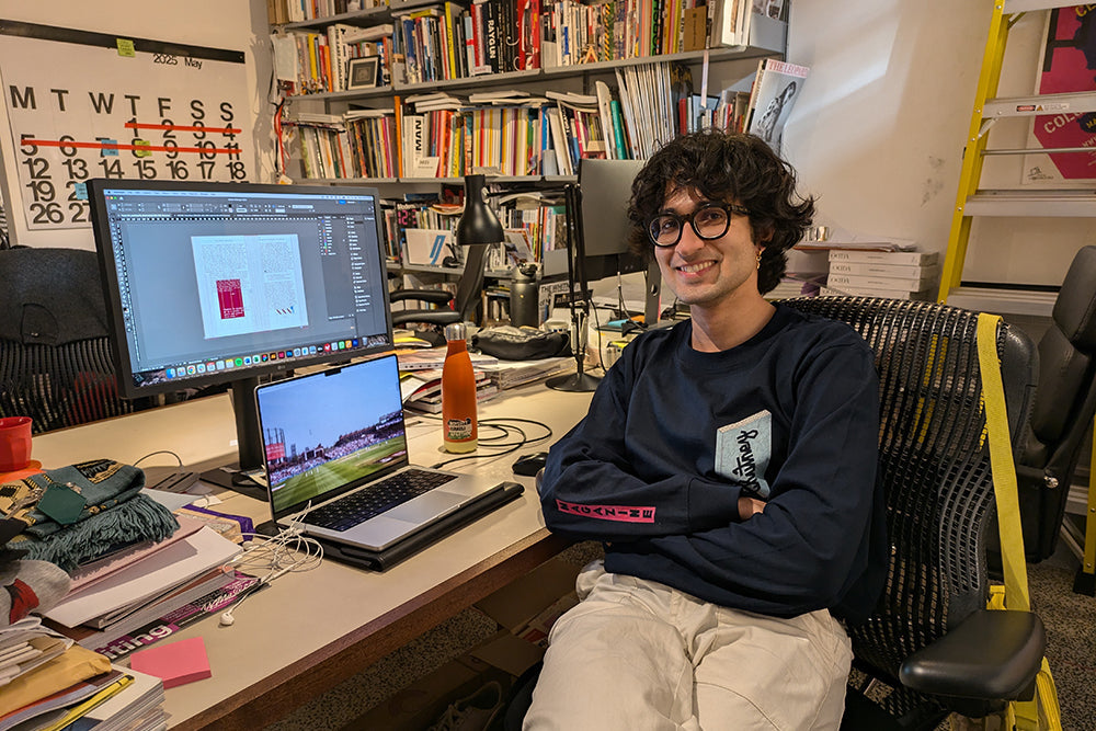
I’ve got a nice, spacious workspace in the magCulture studio behind the shelves in the shop. I sit myself down in front of my admittedly dusty monitor and opposite my colleagues on the other side of our large shared desk. Across and to my right, past an ever-growing pile of magazine submissions, I can see Jeremy with the occasional piece of burnt toast, while shop manager Bella sits directly opposite me. I’ve also recently been joined by our new design intern Harvey, who keeps me company on this side of the desk.
My desk space is a bit of a mess. To my left you’ll find some scattered sharpies, post-its, and a pile of stuff I’ve currently got no space to store at home: a few magazines, a David Bowie sweatshirt from my teenage years, a couple of hats I don’t really wear and my magazine wishlist scribbled on a pink post-it on the wall. On the airwaves, we usually ease ourselves in with something mellow like Air’s Moon Safari—a favourite of former manager Danielle.

Which magazine do you first remember?
My earliest magazine memories are from when we used to visit family in Pakistan when I was a kid—I was born in Lahore, but moved away when I was very young. I remember my grandfather reading both Urdu Digest (above) and Reader’s Digest back in the early 2000s, as well sitting with my mum and flipping through National Geographic at a relative’s house—I distinctly recall looking at a feature on scarabs. Otherwise, there were also my dad’s stacks of Top Gear.

Aside from yours, what’s your favourite magazine/zine?
The impossible question… I might cheat a little here and focus on the magazine that has had the greatest influence on Chutney, which would be Lindsay, a title from Australia celebrating culture and place. My partner discovered it back in 2018 and I connected with all aspects of it it instantly—the design was smart, the stories thoughtfully written and I really appreciated how it featured a mix of places from around the world in a quietly considered manner.
That first issue also introduced me to a few writers that I continue to follow today and would love to commission for Chutney—I was so inspired that I reached out to Beth, the founder and editor, pitching a story. Luckily, she accepted it and my writing was published for the first time in the following issue. Lindsay is one of the few magazines of which I have collected each edition—I wish they’d do a sixth!

Describe Chutney in three words
Introspective, nostalgic, genuine.

The magazine always sports special printed flourishes and finishes. What can we expect this time round?
With each issue, I like to introduce a couple of new textures or subtle finishing touches. Chutney initially started out as a small Risograph-printed zine, 64 pages and saddle-stitched. It was fairly simple and cost effective but upon reflection, even then, there were a few curious things going on—the cover sheet was larger than the text pages and had rounded corners, framing the the pages when opened.

The second issue doubled in size, grew a spine, used more colours, and added texture to the front cover with a glossy thermography logo. It also had slightly weird dimensions—this time the cover was shorter, exposing a strip of the white first page. Don’t ask why!

Issue three saw a big shift away from Risograph to the more cost-effective offset printing, primarily driven by the desire to significantly increase the print run to 1000 copies while retaining a high print quality. It may have lost a little bit of that imperfect Riso charm, but the cover was refreshed with a new logo design, gold foil stamped onto a textured stock.

As for the new issue, the front cover isn’t printed at all. Instead, the logo is subtly embossed on a sparkly pearlescent paper. The colour changes depending on the light—sometimes it’s rendered as a light blue, otherwise it can look teal-ish or even grey. The light illuminates the logo differently depending on the angle as well—it was fun to see people’s reactions at Offprint as they turned the magazine in their hands. It’s appropriately pared back given the nature of the stories inside which, totalling 21, make for the biggest issue yet. But much like the previous issue, particularly difficult to photograph well!

You produce Chutney on your own alongside your day job at magCulture. How do you fit all the work in!?
I studied architecture for five years, so I’m admittedly a bit of a workaholic… my friends and colleagues can attest to the fact that I’ve spent the past few months working on the magazine non-stop outside of regular work hours. Thankfully, issues are released every two years, which in theory gives me a decent chunk of time to work with.
This fourth issue has taken over a year to produce—I started commissioning writers in early 2024, finalised a selection of contributors by the end of that year, began editing back in January and sat down to seriously design the magazine by March. It’s meant dedicating some early mornings but mostly 3-4 hours every evening after work working on the magazine, since the start of the year. And it was a tight finish.
It’s certainly been rewarding to see the issue develop from those initial emails to prospective contributors into a fully formed printed magazine, but also pretty challenging. I’m slowly (and perhaps stubbornly) realising that I simply can’t do it all on my own, so I luckily roped in my partner to help with the sub-editing and image research, plus a couple of friends for proofreading and some illustrations. Genuinely couldn’t have done it without them!
Chutney is inherently political; has that become more or less overt as the political contexts we all work in have become ever more extreme?
Definitely more overt. Chutney was born out of a disillusionment with mainstream (Western) media and its representation of communities of the Global Majority, a deeply rooted systematic issue that is only worsening. With each issue, I continue to learn from both the experiences of our contributors and the socio-political climate at the time of publishing, which I think is reflected in the evolution of the magazine’s tone. This has shifted from being somewhat optimistic and celebratory—slightly romantic even—to embracing a more critical self-awareness that grapples with what communities in are facing today: genocide, deportation, erasure and more.
I think the tension of creating space for these struggles alongside more intimate reflections on cultural identity is most apparent in this latest issue, which was also published with the acknowledgement that magazines, and words at large, can only go so far.

Please show us one spread that sums up how the magazine works, and gives a sense of what the reader can expect from the mag
This spread is from a story connecting examples of Black liberation to the cosmos. It’s one of the shorter, more introductory pieces found in ‘Chop’—the first section of the magazine. It’s also a slightly unusual example as Chutney is typically quite colourful, so this is a very rare monochromatic spread. Still, it offers a snapshot of some of the magazine’s design choices: bookish typography, a full bleed background, plus some irregular analogue-y elements.
In this case, the use of monospaced x’s to form a constellation of stars with the text, which were manually scattered letter by letter. Usually, there aren’t any visuals accompanying each piece in the magazine, so these need to be researched and derived from specific details within the text itself. This spread features an archival illustration of a solar eclipse that corresponds with a date cited in the text, as well as a map charting the eclipse’s path across the USA. Neither image was referenced in the text itself, but the specific date helps bring the visual ephemera and text’s narrative together.

What has publishing magazines taught you that may be helpful to anyone else planning one?
I think the best way to learn is by doing. I know it’s easier said than done, especially if you’re first starting out. Things like finances, time, and resources can be restrictive and inaccessible. But it’s helpful to remember that within those parameters, you’re in control—it’s your magazine, so you get to choose what it looks like, what the focus is, how often it publishes, and what works best for you in putting it together. And most importantly, that way you’ll enjoy it too! This is something I’ve had to remind myself often recently with Chutney—if my heart’s not in it, then what’s the point?
What are you most looking forward to this coming week?
We’re having our first launch event at Tenderbooks in central London this Wednesday. It’ll be a simple gathering with drinks and chats and is the second stop on this summer’s ‘Chutney Tour’—we’ll also be launching in Amsterdam, tabling at Miss Read in Berlin, and then back in London for a farewell party at magCulture, before I head off back to Canada. So, lots to hopefully look forward to, this week and beyond.