Out now: Amuseum #1

With heavily illustrated magazines, it can be difficult balancing text, design and image without the pages looking messy or overcrowded. Illustration can battle discordantly with layout, and sometimes magazines go the other way completely - keeping things clean and simple, letting a sole image dominate the page. Amuseum is an example of a magazine that seamlessly integrates layout with illustration, which makes sense seeing as it comes from editorial illustrator Dan Stafford.

Amuseum is centred on objects – it tells stories through looking at things like a Chinese celestial clock and a chair that looks like a palm tree. Objects are the perfect theme for Dan’s drawing style, as his staple airbrush technique creates a sense of three-dimensionality well-suited to depicting tangible items (above). ‘In a way objects are illustrations,’ Dan tells us, ‘they can embody an idea or a time in a more three-dimensional fashion. I love the idea that an object is a snap-shot of a particular person and also of the culture it was created from/in.’

The magazine uses illustration to emphasise its own status as object. For a piece on rubber gloves, an illustration of two blackened mitts falls over the reader’s own hands (above) - you’re very aware of the fact you’re holding a printed publication. ‘The way I design layouts is greatly influenced by illustration, by my need to speak directly to the reader and treat spreads as whole “pictures”,’ Dan explains, ‘I want to guide the eye and the reader’s interest around the page to give them lots of little surprises and ‘Aha!’ moments.’ The rubber gloves are one of many moments of delight.


The turning of a page is integral to the design as well, and an accordion stretching over three spreads is another example of magazine-y experimentation (above). For a feature on an 18th Century ivory dildo (below), the object is seen from multiple perspectives by having an image of its front and back on the reverse of the same page. The effect is pleasingly slapstick, and its fun to see the object from both sides. ‘Exploring the front, back and movement of one object is all part of our obsession with studying and thinking about the ideas these objects can contain and what they tell us about ourselves,’ Dan notes.


The scrawled information surrounding the object is reminiscent of a pop-up book: a combination of the playful and informative. Dan very much intended this, and places a particular emphasis on the ‘playful’ aspect - ‘I wanted the thing to feel like a summer annual for adults – something “dippable” – and entertaining. I think this is very much the spirit of illustration, almost like a British seaside postcard with a book/bum joke on it.’

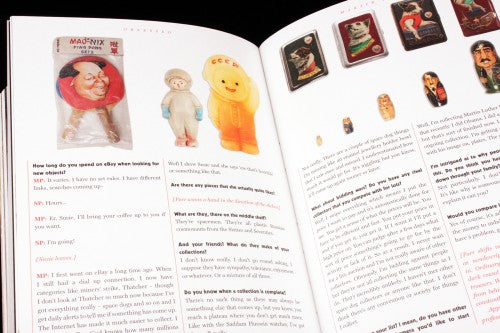
With Dan’s seaside allusion and the tongue-and-cheek tone of the magazine, it’s unsurprising that the main feature is an interview with Martin Parr about his collection of strange objects (above). Parr’s collection ranges from Abba soap to a Margaret Thatcher/elephant teapot to Saddam Hussein’s golden toilet roll holder. There are an overwhelming amount of interviews with Martin Parr at the moment, but Amuseum’s focus on objects allows for a different perspective, one that we haven’t heard before, and it’s refreshing.

Cartoons also abound, and Amuseum isn’t afraid of giving space to long comic strips in the way that many magazines might be. A cartoon of a dog watching a clock for over an hour takes up over eight pages and is drawn out in real time – with one box for each minute (above). Another by Simon Landrein celebrates the sensation of taking a bath, stretching languorously over six pages (below).

Amuseum is an exploration of our obsession with objects, and it brims with puns and pleasing illustrations. Reading through the pages feels like strolling through the British Museum with a sketchbook held under your arm, looking at objects that radiate with history. In many ways, the content rivals the most intriguing cabinet of curiosities.
Editorial and art direction: Daniel Stafford and Stanley Deptford
Review by Madeleine Morley


