Paul Pensom, Creative Review
Last week the UK’s leading design monthly, Creative Review, launched a smart new design by art director Paul Pensom. We start the new week with Paul as he assesses the new design and tweaks things for the next issue.
Where are you today?
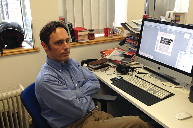
In the Creative Review studio in London. It’s on the Fitzrovia side of Oxford Street, and I can walk there from my home in Archway across three parks, crossing only two main roads the whole way. It’s a great time to get some thinking done.

What can you see from the window?
My desk overlooks the inner courtyard of the old HMV building, now Sports Direct. It’s not exactly bucolic. On a good day the sooty chimney tops are charming, in a Dick Van Dyke kind of way. On a grey day like today you focus more on the dead pigeons ensnared in the wire netting.
Are you morning or evening person?
I used to hate mornings, taking hours to become fully alert, but now it’s my favourite part of the day. As I get older and need less sleep I find myself making the most of the day by starting earlier. Not necessarily working earlier, but avoiding the rush of late rising.
What’s your favourite magazine today?
I’ve just received in the post a copy of Men Only to add to my collection. Long before it became a soft porn Paul Raymond rag it was a pocket sized magazine, which from its launch in 1935 through to the mid-50s had an unbroken run of exclusively illustrated covers and a wonderfully fluid logo. I’ve set myself a long term project to collect all the illustrated ones.
Aside from the covers there is nothing especially notable in the design of , but I find increasingly that there’s a division between magazines of which I admire the design and those which I really enjoy reading. For me a magazine which combines both aspects is a rare beast indeed.
Do you recall the first issue of Creative Review you ever saw?
I don’t recall any particular issue, but I remember it being around at my first college. It was the era of art director Gary Cook, and the Franklin Gothic ’cropper’ logo covers. I was introduced to many great magazines in a short space of time back then: i–D, Colors, Octavo, Eye, The Face. It was such a creative era.
Describe the thinking and process behind your redesign.
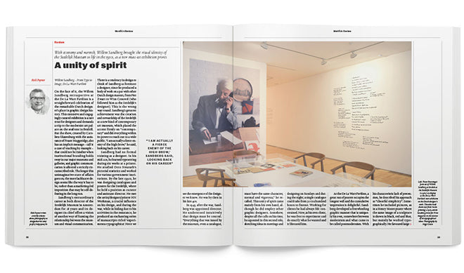
The constant churn in the printing industry requires regular scrutiny of a magazine’s role if it’s to remain relevant. In CR’s case we wanted to broaden our audience beyond the core market of design and advertising and to revisit the question of why we were still in print, and not an exclusively digital brand.
For the redesign, this meant new sections and a greater investment in the magazine as a covetable object, so we now have a textured varnish cover as standard, heavier stock and section dividers. The aim is to make the printed edition feel special.
You’ve redesigned CR several times now; does the process get easier or harder each time?
This will be my third redesign, not counting interim refreshes. Magazines are redesigned for several reasons: to put your stamp on a publication, to put an editor’s stamp on it, to boost falling sales figures, to change format, to justify a price rise, or a combination of the above. Whatever the reason, it’s usually a welcome challenge, since the opportunity to try something different is a powerful incentive in itself.
I’ve been at CR for nine years now, and the process of redesigning definitely gets easier. It gets easier because I’m getting better at it, which is gratifying. It’s good to know that I’m still learning even after twenty-odd years on the job.
What are you most looking forward to this week?
The Creative Leaders 50 dinner on Wednesday. CL50 is a new hotlist from Creative Review celebrating the most interesting leaders of creative teams in the UK. It should be an opportunity for some interesting conversation.
What are you least looking forward to?
I’m trying that 5:2 diet at the moment to shed a little flab, so Tuesday is a fasting day. It’s not unbearable, but I can think of better ways to spend my time.
What will you be doing after this chat?
Ah, the joys of template tweaking!


