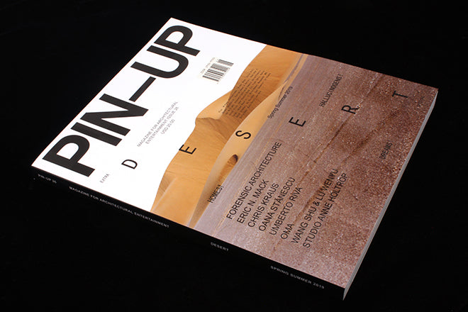
Pin-Up #26
It’s been a while since we’ve written about bi-annual staple of the architecture shelf, Pin-Up, but issue 26’s cover is really quite special.
Plenty of magazines use a partial-gloss print to highlight images or titles on the cover, but Pin-Up have taken it to a brand new dimension by creating a gridded texture with gloss squares that align perfectly with typographic details. It’s not only a great use of printing know-how but elevates a potentially boring image of sand dunes to make me really want to read a magazine about deserts.
Pin-Up is no stranger to playing with the possibilities of paper – they’ve used glossy and metallic paper inside the magazine before, and in this issue both pieces by the magazine’s two big-name writers inhabit different coloured paper. Chris Kraus writes about organising a French Theory festival in the Nevada desert in the 90s, and the lime green of the pages – a coloured paper rather than printed tint– enhance the psychedelic design of the event’s poster, and the bizarreness of the confluence of philosophy, desert and gold lamé jackets.
Eyal Weizman’s essay ‘Ground Truths’, about desert borders and climate change, features on a light grey that reflects the bleakness of his subject matter.
Whilst there is a recurring motif of minimally-painted desert palm trees separating features throughout the magazine, this is a magazine in two halves.
It all begins with the magazine’s usual ‘pin-up board’ – 20 pages of inspirational and offhand snippets. Next, the lengthy section of feature interviews are united by their strong black and white photography and selective colour palette, used for highlights and titles, that gradually morphs through warm and vibrant reds, oranges and pinks. The inclusion of huge pull-quotes on every page mean that this design decision is unmissable, but as a reader I’m slightly distracted by the excessive weighting given to quotes on the page.
The ‘Pin-Up Desert Extra Special’ commences just over halfway through and the magazine morphs again into something different – more experimental and less concerned with remaining in rarefied architectural space. ‘Some thoughts about desertness (Dubai to Dune)’ by Shumon Basar is a creative essay on the ‘fearfully sublime and dreadfully liberating’ desert – and is a constant source of fascinating facts and illuminations from architecture (for example: architects don’t know how to make the windows of the indoor ski resort in Dubai not keep cracking under the temperature difference), to film and TV, and personal experience.
What follows is a set of pieces afforded, paradoxically, more and less space at the same time, which seems to reflect the paradox we just read about of trying to build a city at the border of the desert and the sea. Double page spreads with photographs in varying shades of desert beige spread across many pages – leaving only an inch at the side for the text to be squeezed in, just three or four words abreast.
The titles, however, command space like concrete poetry, occupying shapes rather than lines across the images – and it makes for a confident magazine-within-a-magazine that conceptually brings its subject matter to the page. A very strong issue from Pin-Up.
Editor & creative director: Felix Burrichter
Art direction and design: Erin Knutson


