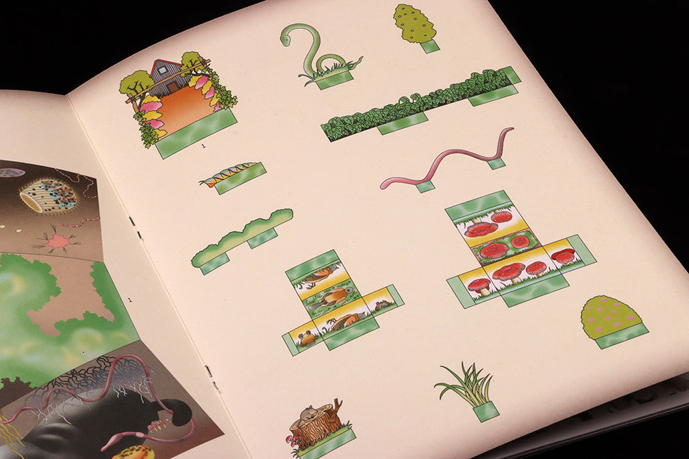
Pleasant Place #3, Compost
We miss our Page 23 posts! So here’s the first of a new series. This one comes from the centre spread of the latest issue of gardening mag Pleasant Place, and isn’t actually numbered… indeed, although it’s the 23rd page of the issue, it’s a false number 23.
This is because the centre spread is an extra four-page section, produced on a heavier paper stock and featuring the magazine’s trademark cut-out graphics. This allows an artist to create a thematically linked set of images that can be cut out to create a miniature 3D model (this time, Seoul-based Hanna Something designed a beautiful set of creatures and mushrooms for you to create your own little garden).
Being positioned at the centre spread means a four-page section of the heavier stock can be slipped in, and that the reader can cut up the page without damaging other parts of the magazine. Even if you don’t cut out the elements, its existence offers a visual surprise at the heart of the magazine.
Either way, it’s a lovely example of the physical possibilities of switching papers and flatplanning pages cleverly.
And that false 23? The Pleasant Place team decided to place the centre spread outside the page numbering, so after page 20 we have the four pages of heavier stock before the numbers pick up again with number 21. That centre section really is an extra section!
Editors-in-chief Guus Kaandorp, Floor Kortman and Lou-Lou van Staaveren
Design Miquel Hervas and César Rogers, Fanfare


