

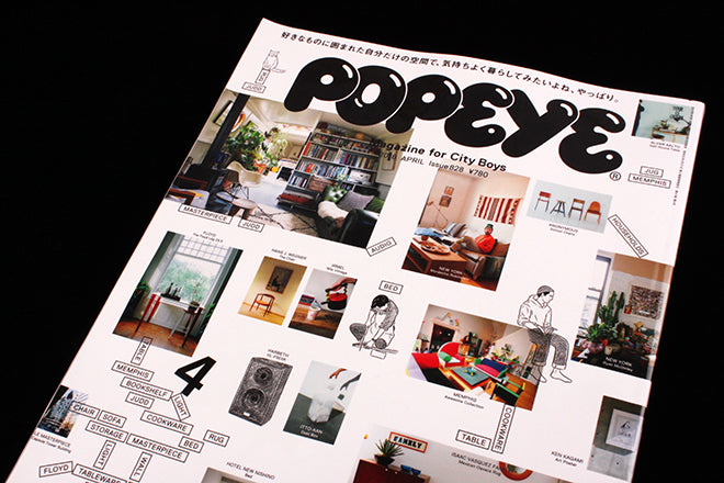
Popeye #828
A personal highlight of last week’s U Symposium in Singapore was hearing editor-in-chief Takahiro Kinoshita talk about his magazine Popeye. Speaking in Japanese, he was ably translated by colleague Natsumi Oh as he talked through the 40-year history of the monthly magazine for ‘City Boys,’ more of which will follow in a later post. Having been won over by his talk it was a pleasure to meet him and receive the latest copy of Popeye; here it is as magazine of the week.

The issue of foreign-language magazines has been discussed here before; but if coping with German or French can be difficult, Japanese is obviously harder. Even the liberal sprinkling of English words (as on the front cover, detail above) doesn’t really help. Used with slightly more meaning than a Brit designer dropping some Kanji on a page because it looks cool, they remain as much decoration as vital page component.

Every issue of Popeye is themed; from City guides (London, Brooklyn, Tokyo) to more obscure ideas like Dating Manual, Ways to Be a Man and The Complete Walker, the theme takes up a significant part of each edition. Issue 828 is This is How I Want to Live, a guide to interior design, finding property and even a little DIY. Visits to the NY apartment of photographer Ryan McGinley (above and below) and the London boathouse of Matthew Wright bring a flavour of Apartamento to the pages, while elsewhere the pages break down in to the catalogue-like listings beloved of Japanese mags (also below).

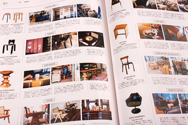
With four pages of chairs, shown in situ, a spread of (on a rough count) 800 examples of cutlery and nods to key contemporary influences like the Memphis group, this is an extraordinary feat of research.

Hand drawn portraits break up the product shots on the page (above) and elsewhere fashion photography is given a rough hewn collage feel (below).

Everything feels very thought through – nothing is left as a simple page of writing and images. Everywhere there’s something extra added: a bit of English text, a little drawing, captions, a fake ‘menu’ background effect.

The back features a monochrome section on pink paper that makes the same odd visual and typographic references that Manzine did a few years back. It was evident from Takahiro’s talk that the team rely on obscure Western publications and designs for both visual and editorial inspiration, and there’s clearly a similar heritage here.
In its heyday Popeye sold over 800,000 copies a month, a figure reduced to 180,000 today. Even at that smaller figure it may seem strange to compare it to an independent magazine, but Popeye shares a lot with far smaller titles. It fitted comfortably among the independents at the U Symposium, sharing a similar dedication to glorying in its subject, and feels like the missing link between mainstream and indie. The difference is resource, of course, but that is used to make the printed magazine richer in content not vaguer in purpose. Highly recommended.
magazineworld.jp/popeye/popeye-english