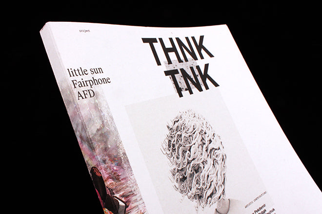
Thnk Tnk #2
Why are there so many excellent student magazines in Germany? Every time I go to Berlin’s Do You Read Me!? I’m struck by the number of publications that are produced by graphic design classes or students around the country. It seems that making a magazine is a standard end of semester project for art students, a chance for them to put what they’ve learned about composition, layout, type, and design in general to the test. We’ve highlighted Some Magazine from Halle’s University of Art and also Protocol from Berlin’s University of the Arts on the Journal before.
Thnk Tnk from Bauhaus University in Weimar is the latest student magazine to catch our eye. It stands out because of its atmospheric, heavily typographic and monochrome layout. It’s also a striking object to hold because of its open, Swiss binding (above) and the juxtaposition of a card-like cover paper stock with a glossier interior. This second issue is themed ‘social entrepreneurship’.
If anything lets the magazine down, it’s that some of the English translations are a bit off. If you don’t have a good translator at hand, my feeling is always that you shouldn’t bother making something bilingual. I can see why designers of magazines – especially if they’re students – like having multiple languages to work with though: organizing two translated texts is a fun design problem to solve, and Thnk Tnk’s solution, which sits different typefaces and font sizes next to one another (above), is very good looking.
For German readers though, the text is fluid and provocative. There’s an essay on Olafur Eliasson’s Little Sun project, and a discussion between a philosophy student and a member of the right-wing Young Alternative for Germany party. For this latter piece, the differences in the two speakers’ opinions is emphasized by the fact that the type designating their voice is rendered in opposite colours (below).
Tightly packed photos sit inside columns of text in a way that’s intriguingly claustrophobic but also well balanced (above). The spreads are an interesting mix and use the white of the page to different ends: some pages are compact and cluttered, and in other places they’re spread-out and breezy (below). The combinations create an arresting visual rhythm.
Thnk Tnk and others like it point to one the reasons why Germany has such a strong history when it comes to editorial design – students learn about it and practise early on. Issue two of Thnk Tnk with its careful layout and detailed attention to type, suggests a continued bright future when it comes to printed matter in Germany.
Design: Felix Egle


