

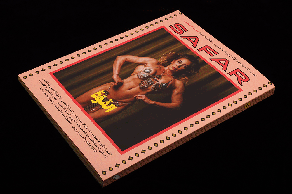
Safar Journal #6
Following a slightly slow start, Safar Journal has developed into a vital presence on the indie mag scene. First published in 2014, the last three issues have seen the magazine stick to a biannual schedule as the team focused on their double-headed niche. As issue six arrives, it seemed a good time to take stock of the project.
Published from Beirut but with an increasingly international footprint, the magazine proposes an alternative to the traditional (western) history of graphic design. But the name Safar translates as travel: this is a magazine of dialogue as much as opposition.


From the first glance the desire to promote communication between different regions is explicit in the use of two languages: approach the mag from the traditional western angle—reading left to right—opens up all the stories in English. Open it from the other end, and read them right-to-left in Arabic. The entire issue, then, switches page by page from Latin to Arabic (I’d love to know how they manage the flatplan).

That the two languages use different alphabets makes the design simpler and more effective—bilingual publications can often suffer from the translations looking the same. Here, the Arabic characters and their Latin counterparts stand apart. Indeed, the very use of two alphabets expresses so much about the aims of the whole project.
The use of a vivid yellow for all text pages is also noteworthy, binding the text pages together; indeed the overall approach to the page layouts is a satisfying combination of function and style. The design never overwhelms the content, occupying a unique position between contemporary and timeless and western/eastern.
But the magazine is not only a plee for a broader geographical understanding of graphic design. The Safar team—led by Hatem Imam and Maya Moumne, principals of Beirut’s Studio Safar—are also questioning our understanding of what graphic design is. They (correctly) regard design as a form of cultural production in its own right. This is perhaps more evident in independent magazine publishing than other areas of design, and certainly Safar revels in sharing stories that cross boundaries in every sense, taking the reader in unexpected directions.
Where Safar is particularly succesful is in translating these bold ambitions into engaging stories, something achieved using a different theme every issue. This latest one addresses ‘Power’; a quick run through some of the stories demonstrates the scope such a theme offers.

Monika Halkort examines the use of technology in mapping the migrant crisis in the Mediterranean Sea (illustration by Giorgia Labaki, above). Two opposing forces are at work: the need for invisibility when crossing the sea, and the rise of activist support using tracking technologies to map and, where neccesary, help. We’re so used to governments having these powerful abilities, it’s refreshing to hear the same tech being used in a humane way.

Two conversational features stand out. First, Tala Safié and Kelly Walters discuss their respective experiences of US design school (above). Both studied in the States; Tala is originally from Lebanon and Walters is now a design teacher herself. They discuss their experiences of how design is taught, considering how the liberal arts system moves on from merely teaching a point of view to reflecting that same point of view in its curriculum.
You might recognise Tala Safié’s name; she was a key part of the much-missed Eye on Design magazine team a few years back and now works at The New York Times. Safar is full of these connections; part of its strength is its international network (this latest issue is printed and distributed from London, while the editorial team are spread internationally).

The second conversation sees Safar co-founder Maya Moumne interview Pentagram New York partner Michael Bierut (not Beirut). The humorous part of this is his surname, addressed in a sidebar (above, below), but the conversation starts with the TV show ‘Succession’, and Bierut’s experience of similar power dynamics among his corporate clients before exploring the changes in our understanding of the graphic design canon. The issue is worth it for this feature alone.

The ability to address design from obtuse and direct angles at the same time is Safar’s other great strength. The entire magazine is a reminder that loving something should involve questioning the subject rather than slavishly fawning over it.