Somesuch Stories #3
When an editor drops their latest issue off saying ‘There’s a story printed upside down, but don’t worry, that’s deliberate,’ you might expect something brilliant but unreadable. Instead, the latest issue of tiny literary mag Somesuch Stories is a subtle visual delight.
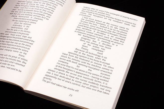
Previously the paperback-ish publication has left overt design to the front cover – the last issue featured a shiny chrome paper that looked great but soon dirtied. For this third issue, designer Fraser Muggeridge uses a plain sans serif font throughout, and shifts the setting from ranged left, to justified to ranged right at will. It’s a surprisingly simple intervention that reflects the issue’s theme of disorientation and is not nearly as disruptive as it sounds. It takes skill to do and retain legibility.
There are further small typographic ticks throughtout – uncomfortably slight size changes in the capitalised titles for instance – but the biggest design feature (beyond that upside-down section) runs though a piece titled ‘Hourglass Figured’ where the layout shifts to full-on concrete poetry.
Our page 23 sits in the middle of this story, one of 11 where the text is coarsely forced into an hourglass silhouette shape. It’s so brash, shameless and contrary to accepted typographic norms you have to like it.
Editor: Suze Olbrich


