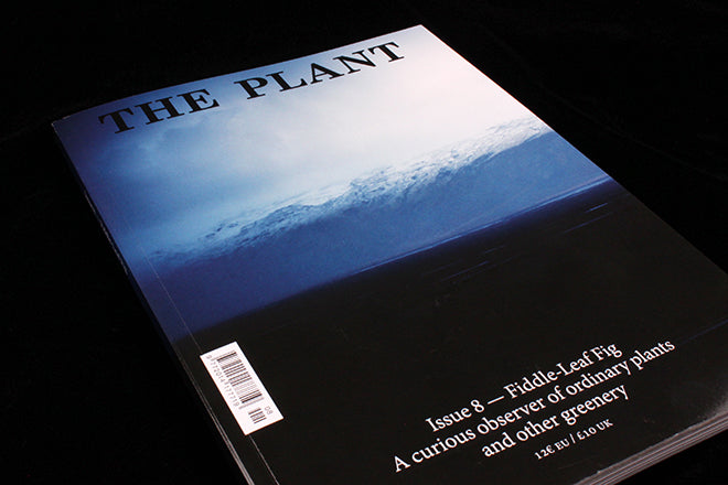
The Plant #8
The newest The Plant has been a long time coming, and as soon as I saw the hefty size of issue eight, I knew that it was worth the wait. The dark blue, black and hazy white cover image suggests that the horticultural journal has turned a new leaf: in the past, covers have been bright and eclectic, and there’s something more subdued and mature about the icy sunset that graces the new front.

 For those who haven’t read The Plant before, each issue is themed around a different plant (in this case, it’s the violin shaped fiddle-leaf fig), and at the back the editors invite different illustrators to draw their own version of the theme. These drawings are then printed in a mellow green alongside instructions and tips for taking care of the plant in question (above). The fiddle-leaf fig seems the favoured choice for contemporary illustrators at the moment; it’s got that same bulging, cartoonish form that you see in Matisse prints and which seems to be a prevalent source of inspiration currently. Marcus Oakley’s print captures the fiddle-leaf with particular Matisse-like zeal, and Thomas Murphy’s child-like hand also contains a hint of early modernist painting (also above).
 Once The Plant felt quite Apartamento-like in its layout, especially because of the way that it juxtaposed text and photo on opposite sides of the page. With issue 8, though, the magazine has really come into its own, partly because of the photography’s quality has sharpened and also because the spreads have become more varied. An article on the garden in the film The Last Year at Marienbad is laid out in a way that is crisp and cinematic (above), the design plays close attention to The Plant’s aesthetic while still alluding to the content. At other times, the journal erupts into spreads of jumbled, organic forms (below), similar to the way that a garden can suddenly become more feral if you stray from the path.

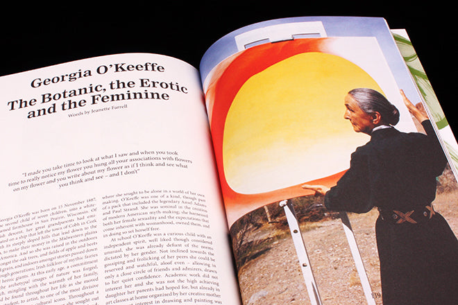
 Some of the art and design that The Plant features in reference to its horticultural theme are classic, and you couldn’t imagine a journal about flowers and shrubbery without it. An in-depth essay about Georgia O’Keeffe is one such example (above) - an artist that a plant-themed publication would be mad not to include. At other times the features are more surprising and unexpected, like a piece on industrial designer Max Lamb’s use of tree stumps for chairs (below).

 There’s also a Do-It-Yourself guide to making concrete flowerpots (above), a short history of the piss-plant, and a look through French garden designer Gilles Clement’s garden (below).
 I think that The Plant is at its best when it draws on its theme to look at how contemporary design, art and illustration is informed and entrenched in the organic world. It’s a magazine that has chosen a topic that’s very on point in terms of the current Zeitgeist, almost like The Gourmand with cooking. Pots of cacti or spider plant sit alongside penholders in most creative office environments these days, and illustrators seem to be choosing to draw fiddle leafs over computers, space stations or electronics when they get the chance. That’s why stories on designers like Lamb are particularly excellent; it’s an example of how The Plant uses its theme to aptly shed light on what’s happening in art and design today.
Editor-in-chief: Cristina Merino
Art director: Isabel Merino & Carol Montpart


