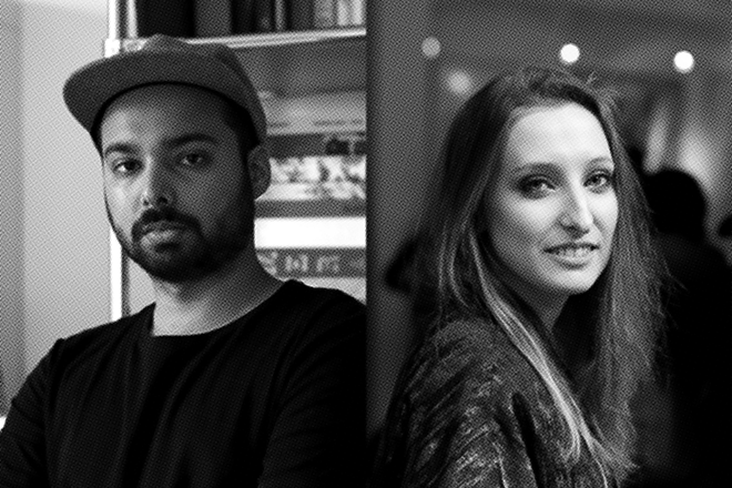
Dennis Moya and Tiffany Bähler, Ligature.paper
Swiss design studio Bähler Moya have been running their Ligature.ch blog since 2011; it’s a platform that they use to speak with contemporary graphic designers that they admire, and profile work they find interesting. Tiffany Bähler and Dennis Moya, the team behind the studio and blog, have just released the first edition of Ligauture.paper, a newspaper version of their site produced using the Newspaper Club. We start the week off catching up with Tiffany and Dennis.
 Where are you today?
Dennis & Tiffany: We are at our flat which is our studio too. It’s located in the old town (La Cité) of Lausanne. We are drinking some tea and Tina, our black cat, is sleeping next to us.
 What can you see from the window?
D & T: The streets of Lausanne with people going to work.
 Are you a morning or evening person?
D: Evening.
T: Morning.

What’s your favourite magazine this morning?
D & T: The latest 032c and QNDMC’s third issue. It’s a French independent magazine (below) designed by Nicolas Franck Pauly.

What’s your favourite design studio this morning?
D & T: There are too many but we should mention Ludovic Balland for graphic design. In terms of type design, Swiss Typefaces (Ian Party, Maxime Büchi, Emmanuel Rey) is one of the best type foundries in the game. Finally, we should mention the Zurich-based industrial designer Jörg Boner.
 You’ve been running Ligature.ch as a blog since 2011. What made you now want to produce the content in magazine format?
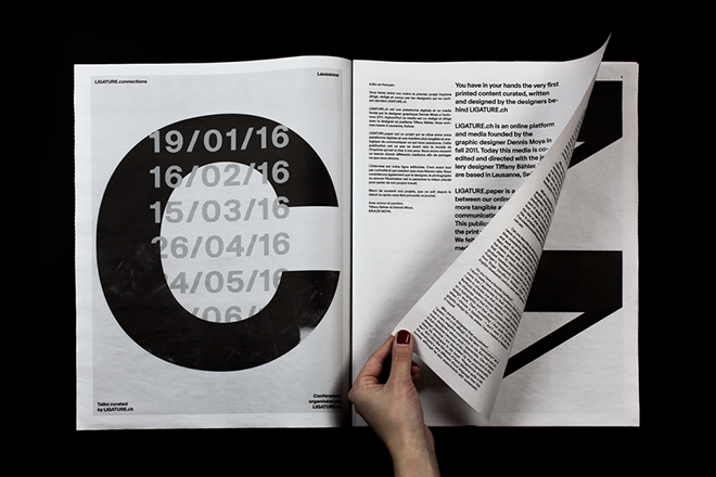
D: The idea of making a magazine was always been there since we started the blog. We were finally motivated last year to publish a limited edition, which had 300 copies. The idea than materialised that we’d use a newspaper format with four exclusive interviews for our first issue.
 How did you select which designers would go into the first issue?
D: It was a ‘right time, right place’ kind of thing. Last summer we met graphic and type designer Simon Mager in Lausanne and Nicolas Polli joined us when Simon said that they were good friends. By the way, they're now working on the art direction of the next Yet Magazine, which Nicolas is the co-founder of.
 We also thought that it was the right time to re-interview Notter & Vigne and focus on their work for Rick Owens. And finally, we were interviewing the designer Cecline Manz anyway and then we thought that the pictures of her products fit perfectly for the project.
When designing a design magazine, art directors either go for a minimal framework or they use a lot of design tricks and colour. You’ve gone for the former: why did you opt for such a stripped-back layout?
D: For me it was the right way to start this project. It's a sort of personal manifesto. The layout refers to our Swiss legacy, but through a contemporary lens. This is why we decided to use a lot of white space and to play with text blocks in a way that creates tension - we saw them as geometric forms on the pages. Using contemporary typefaces was also essential, as was the way we displayed the work of the people that we interviewed.
What are you most looking forward to this week?
D & T: Preparing the next Ligature.connections event.
What are you least looking forward to this week?
D & T: The sad news from the world. We don’t have TV and thanks to that we check and read as little as possible about the horrific things that happen everyday.
What will you be doing after this chat?
D & T: Working on upcoming interviews.


