Tina Smith, editorial designer
This week we explore the magazine collection of editorial designer Tina Smith, who as well as being creative director of Ernest Journal, was one of the founders of Lost in London and has worked at most of the UK’s publishing companies.
We asked her to pick out three items from her collection…
An old issue
For my something old I have picked National Geographic. I inherited a vast collection of these from my grandfather – with just a few missing issues that didn’t make it to him during the blitz. In a transient digital age, where copy stays malleable, apps become unsupported and apple music replaces your rare recordings with radio edits, there’s something reassuringly permanent about a row of bound volumes stretching back to the 30s.
The yellow spines of National Geographic are rows of mini time-capsules, stitching the past to the present. The last 100 years is a uniquely documented stretch of time, preserved as seen through contemporary eyes – it’s easy to take that for granted, but it's pretty amazing. I hope we can innovate to keep these old journals of record going another 100 years.
A new issue
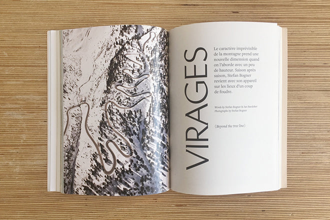
It was almost impossible to pick something new – but I’ve settled on Les Others. I love a neat insight into the fascinations of other people, and this mag does that beautifully. The recent Ernest redesign was largely about unshackling ourselves from our old structure and allowing each feature to go off on its own, bespoke tangent, so the “unexpected” philosophy of this issue was a good fit for my own frame of mind.
It probably helps that I’m a fully signed-up Francophile and read this on a month-long, unplanned meander around France, but Les Others gave me plenty of the snap, crackle and pops of inspiration I look for in a magazine.
And another thing
I’ve picked this book, ‘The New Nature Book’, for its sheer abundance of enthusiasm. The playful bordered images were an inspiration I drew on in my first indie mag, Lost in London, and I love how innocent and unselfconscious the design is. I don’t think there’s another book that can match it for exclamation mark use. It’s great to remember how the most commonplace things are fascinating when you look closely, even “Yawns!”.
Twitter: @ErnestJournal


