Victory Journal #10
We first featured Victory Journal with their second issue back in 2012. The large-format unbound pages made an immediate impression – the 11" x 16.5" pages showed off the photographic content in dramatic fashion. Smaller magazines are cheaper to produce and easier to distribute, but Victory have retained the large page size and recently moved to perfect-binding; this tenth issue weighs in at an impressive 164 pages.

The Brooklyn-based editorial team – the mag is published by design studio Doubleday and Cartwright – have carved a lovely niche for their sports mag. Instead of stats tables and fanboy portraiture, Victory revels in the glory and disappointment of sport, in the personal experiences, stories and memories of participants, and does so primarily through photography and art.

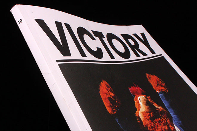
The issue leads with a feature about seventies sports team mascots, as created by Muppets staffer Bonnie Erickson (above); this is a typical Victory piece and provides the front cover parody of a celebrating sportsman.

Another piece highlights the work of sculptor John Ahearn who has spent the last thirty years casting the people of the Bronx in their street settings (above).

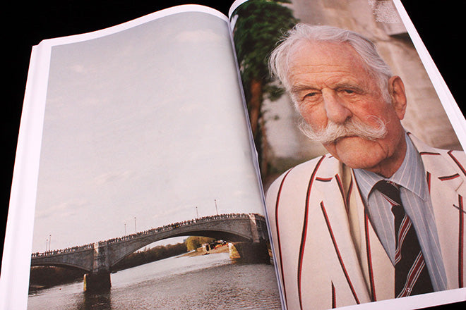
So far so New York. Other stories take us to London and the Oxford–Cambridge boat race (above), an English ritual I imagine unknown beyond our shores. This spread demonstrates how the page size allows a variation in scale page-to-page that a smaller magazine would avoid: the detail of the bridge is crystal clear.

The pictures look fantastic on the large pages – as on this opener to a piece about the Vensus and Serena Williams sisters (above) shot by Justin Lane at the US Open – and any question over whether the team could keep up the high standards they set from the start has long been quashed. The following five spreads of the Williams sisters celebrate their unique position at the top of their sport, and is a rare excursion into mainstream sport in the magazine.

Like all great editorial ideas it’s so surprisingly simple it’s remarkable nobody’s done it before. From the full colour agony of the US Open, to Cheryl Dunn’s black and white reportage from he Kentucky Derby (above), we see sport from every angle.

We also get to read. Full-page images dominate but texts unapologetically fill whole pages too, such as this 1964 report from Esquire about a boxing match (starkly illustrated by David Rathman). The design is no-nonsense and functional. Monochrome and efficient, the single touch of flamboyance is the contents list, The Ten (shown at top of page), which spells out the highlights in a list of words, some directly linked, some more abstract, teasing the reader about the content.

Other drawn images include a beautiful series of sports images by Raymond Pettibon (above) and a set of works by contemporary artists, including a collage using yoga mats by Alex Ebstein (below).

Victory Journal has developed into a heavyweight proposition in more than just mass; this new issue pulls together a strong range of visual stories that add up to an unclichéd and fascinating record of the reality of sport, bridging the gap between the tabloid superstar and our amateur attempts to join in.


