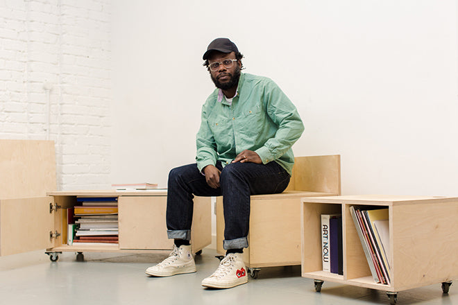
Olu Michael Odukoya, Modern Matter
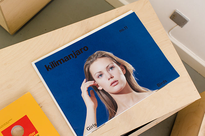
Previously responsible for the large-format art magazine Kilimanjaro, London-based creative director Olu Michael Odukoya now publishes Modern Matter, another publication that relishes its physical presence. Every issue takes a slightly different form, and the content often uses the process of production to challenge editorial conventions. We look ahead with Olu at his week.
Tell us about your typical Monday journey to work
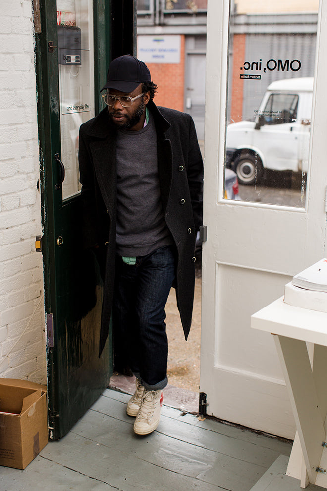
A typical day would start by hanging out with my children before the chaos of the school and child-minder run becomes a reality. As I work for myself, the need to be desk bound for 9am is not a necessity, so I drop my daughter to school, and spend some time with my little boy before dropping him to the child-minder, sometimes going via the park for a quick adventure.
My commute is relatively quick, and I use this time to loosely structure my working week and what that might this comprise of. Each day/ week is so varied and I’m not really a big fan of structure – but I like to flag key moments so they are top of mind.
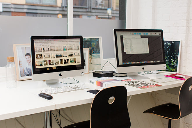
Describe the state of your desk and what you can see in your office
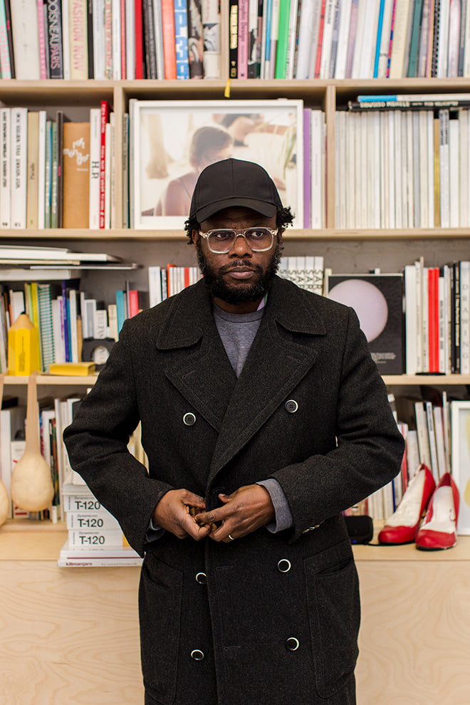
My studio is bijou, intentionally, as the bigger the space, the bigger the mess I would make. I have lots of books, magazine and artefacts and like to have these on display and within easy reach for inspiration and reference.
When I moved into the studio, I commissioned a carpenter to create a floor to ceiling bookcase, which houses a vast amount of material include works of art from friends like Sarah Lucas.
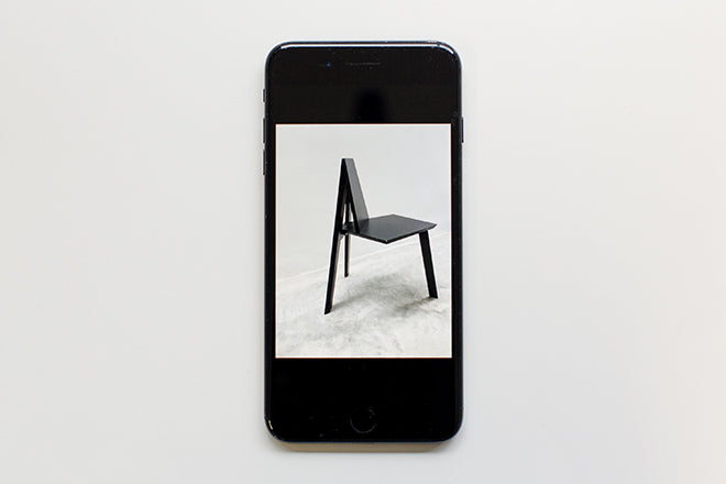
Outside of my work as a visual curator and publisher, I also design a contemporary furniture line called Joko (the name comes from the Yoruba language and means ‘sit down’), so tend to use the studio as a showroom and testing ground for new pieces.
Which magazine do you first remember?
Ironically as a magazine curator, I was never a big magazine consumer. I created Kilimanjaro as a platform for my ideas – it just happened to take the shape of printed matter. From there, I got the buzz and went on to create Modern Matter which although again, takes the form of magazine, is more a collection of discussions, experiments and ideas.
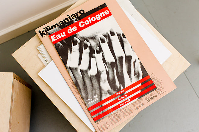
Having said I’ve been a big fan of Eau de Cologne Magazine, which was out in the mid 80’s and published more as an art-zine by gallerist Monika Spruth. Reading through this give me endless joy.
Which magazine matters to you the most right now?
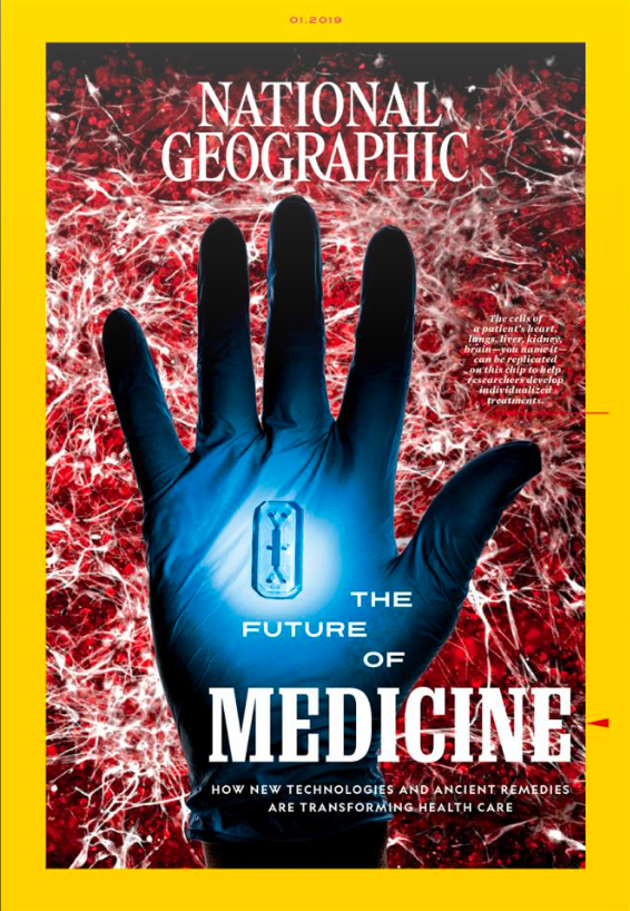
It’s magazines that provide information and knowledge in digestible bites that I find most interesting. Classics such as Time and National Geographic are super effective in knowledge sharing and dissect what might be deemed a highbrow topic in a way that the average person can connect with. In a time of social story telling, their analogue approach seems even more relevant.
Can you describe your magazine in three words?
Chaotic, Magical, Free
What did you learn from Kilimanjaro that you’re applying to this project?
Kilimanjaro and Modern Matter are separate entities, partners in crime if you like, that although complimentary are standalone projects. Kilimanjaro quickly become lovingly adopted by contemporary artists including Roni Horn and galleries such as Hauser & Wirth, as an unofficial catalogue and vehicle for artistic expression. The large-scale newspaper format provided room to breath for the content.
Ahead of launching Modern Matter, I worked on the relaunch of Pop Magazine with Dasha Zhukova and Ashley Heath. The ability to revamp a title that had helped shape popular culture with a broader cultural lens was an interesting challenge.
Modern Matter is always highly physical: the concept of the issue is reflected in its object-status. What’s the process behind that?
Completely, this has become our USP and it’s an idea that I am keen to explore further. In the current age of everything feeling homogenous, I wanted to exaggerate the concept of what is deemed best practice in relation to magazine covers.
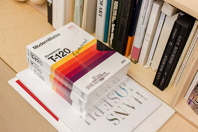
I’m not interested in having the ‘face’ of the moment, or worse still a subject who has a huge social following. Our readers are less interested in these measures of social acceptance. I’ve previously created a bumper 600 page issue where 50% was made up of blank pages, the current (Remastered) issue repeats the content twice over with the repeat content printed in an offbeat colour profile. Our previous issue titled ‘Mother’ was packaged alongside a mini version we named ‘Child’.
Subtle but significant nuances are what I think provide the emotional connection with the magazine that our readers love.
The magazine straddles fashion and art, how do you cover both fields and still have the edge in both?
I naturally have an interest in both, but feel I look at these topics in their broader sense finding universal similarities and conflicts that connect them. I’m unorthodox in the way I approach my work – especially in how I create Modern Matter.
I very rarely start out with a clear end goal, but instead meander through the creative process not being limited by rules. I then retrospectively connect back the dots that thread together a mood or theme. It generally falls into place at the end.
What’s going to be the highlight of the week for you?
I’m planning my trip to Milan’s Salone del Mobile in April, which should be interesting. We are relaunching our website as we have a catalogue of lots of new work that we are keen to share. Of course working on the next issue of Modern Matter for which we will be stretching the creative boundaries even further.
What are you doing after this chat?
Thinking about what’s next… I’m always thinking of the next and the new.
Photographs above by Ollie Adegboye


