

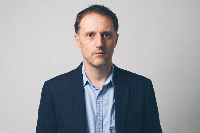
Peter Mendelsund, The Atlantic
Peter Mendelsund has been described by the New York Times, referring to his book cover designs, as ‘one of the top designers at work today’. He also writes both fiction and non-fiction books, and has recently been working on his first magazine design project: a complete redesign of US monthly the Atlantic that has just launched to much attention. We spoke to him about adapting to the world of the monthly magazine, and his belief in the gestalt of hierarchy.
Tell us about your typical Monday morning
I always leave my apartment much later than I should, as I tend to write (I write books) or practice (I’m a former pianist) in the mornings and generally lose track of time. So I’m usually running to the subway. When I’m on the train, I either write more (on my phone or else longhand in a notebook) or I pop on my headphones and listen to some weird medieval music to try to calm my heartrate.
I exit the subway with the other spawning salmon at 26th street and speed-walk the three blocks to the office. Normally I will have forgotten my ID, so I have to ask the guy at the door to buzz me in. He will do so only reluctantly. By the time I make it to my desk there are forty things that need my immediate attention, and I’m already frazzled beyond repair.

Describe the state of your desk and what you can see in your office
My desk is very spare. At the moment, I have a copy of Ben Kafka’s brilliant book ‘The Demon of Writing’, next to my former advisor Arthur Danto’s book ‘The Transfiguration of the Commonplace’ (these books have nothing to do with one another, I just happen to be reading them simultaneously.)

I have a small stack of copies of my recent novel ‘Same Same’, next to a plaque that reads “Mr. Stephens; Head of Catering” which I own for reasons far too complicated to explain.

Also impossible to explain: the presence of a plastic femur, and a bizarre illustration of the philosopher Slavov Zizek.

Out my window is Madison Square Park, and a long, imposing row of urban fortresses, each of which houses a major insurance giant.
Which magazine do you first remember?
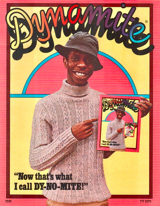
My first magazine memory was of Dynamite magazine, which I subscribed to as a child. I think the first copy I ever held in my hands had Jimmie Walker on the cover. I also subscribed to MAD. And Dragon. Then, later, Omni, then, even later, Thrasher. I loved all of these magazines beyond measure.

Which magazine matters to you the most right now?
I hate to say it, but I don’t really read magazines anymore. I barely have time to read books. Or see my children. Or eat. Or sleep.
As a designer you’re best known for your book work. How did you find adapting to a magazine context?
What’s a magazine? (No, seriously, I’m still trying to figure this out.)

Everything is different! Schedules, workflow, terminology, mission, execution, the way one works with photography and illustration, typography, the forms of freedom, the kinds of constraint, even the people are different (turns out I like journalists a lot.)

I’m sincerely hoping that my ignorance of the magazine medium might allow me (and my partner in crime, Oliver Munday, also a book person), to make something truly unusual. And perhaps, it will help us to make a readerly magazine, which is what I imagine is called for here. I’m hoping.
I should also say that everyone ELSE on my team on the magazine side here DOES know a lot about magazines, so I’m massively grateful and indebted to photo director Luise Stauss, and the incredibly talented design team- Paul Spella, Arsh Raziuddin, Katie Martin and Emily Jan.

Describe the redesign process
I was brought into the conversation initially by Laurene Jobs, who I had done some work for, and then was hired by editor-in-chief Jeff Goldberg. Oliver and I (Oliver and I work together hand in glove—almost symbiotically—we are two parts of the same designer) spent months interviewing people here, performing a kind of brand psychoanalysis (“what does ‘the Atlantic’ mean to you?”) and excavating artifacts from the extensive archives.


The magazine has been around since 1857, so there was a lot to sift through. Including the original “Battle Hymn of the Republic,” and the first printing of Robert Frost’s “The Road Not Taken,” and a letter from Abraham Lincoln about the Atlantic’s importance. Not to mention the original manifesto, which was created by some pretty amazing signatories (Melville, Hawthorne, Emerson, etc etc)
Aside from Oliver who were the key collaborators on the redesign?
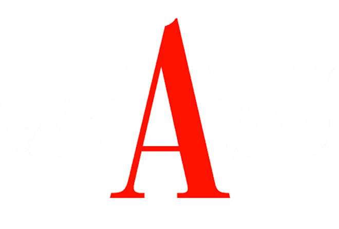
We worked with typographer Jeremy Mickel of MCKL type foundry to a/ help us redraw the curves on the big “A,” b/redraw our Atlantic wordmark, and c/ create a custom typeface for us: our “Atlantic Condensed.”

Luise Stauss our photo director, came on board just before we began preparing issue one was and was crucial in the making that first issue, and I’ll let her speak here:
‘Redesigns are the most invigorating moment in the life of a publication. The tip to stern redesign of the Atlantic magazine presents a singular opportunity for photography. There has never been a photo department at the Atlantic, and my sole mission here is to elevate the imagery to match the stellar writing. Like the articles themselves, photography should reflect the diverse voices and viewpoints of America. Our commitment to great imagery comes at a unique period in the 162 year history of this institution. With the magazine growing across all platforms, the role of photography has never been more urgent.’
Then we had the talented in-house team: Paul Spella, Arsh Raziuddin Katie Martin, Emily Jan, our Art Director on the web side, and then Andrew Phelps, and Jim Quindlen and their teams on the web and app development side. There was a real wealth of talent to draw on.

Outline the structural and strategic changes made to the Atlantic
Using the “A” was, obviously, a huge change, and it was actually, surprisingly, happily well-received right from the get-go (I always feel like if you’ve thought a problem through carefully, it should have a decent chance of getting approved!)

The biggest architectural change to the magazine was to move the culture coverage to the back of book, as the reading experience felt more balanced that way. Another innovation here was the introduction of the cover flap, which allowed us to remove a lot of the (what I felt were excessive) story sells on the front cover.


The biggest struggles for me and Oliver and the design team entailed disputes around how full a given page should look. Oliver and I felt fairly strongly that every page should say no more than it needs to, and that there is no reason to fear blank areas of that page. Text should be legible, and unfussy, and art should amplify, without pointing at itself overly.


We also like to think that any given space, anywhere in the magazine or on any other surface, is a zero sum game, and can only contain so many elements. Which is to say that after a point, the inclusion of more elements leads only to the diminishment of what you began with.

When people meet in rooms to discuss design, they often forget about this gestalt. They will say “make this bigger…oh and this other element also needs to be prominent…and this one too…” and in the end nothing reads as important. I find I spend a lot of time reminding people to think through an order of importance, to create their own hierarchy of information.
What’s next for you?
Well, my second novel is coming out this year with FSG. It’s called ‘The Delivery,’ and it’s a parable about alienation and belonging, emigration and language … and same-day package delivery.
I also have another book, on design and literature, coming out with 10Speed this year called ‘The Look of the Book.’ Other than that, I’ll be creative directing here at the Atlantic for the foreseeable future… I’m hoping that some year in my near future will be spent back at the piano. I’d love to record music again.
What’s going to be the highlight of the week for you?
Getting home tonight, sitting down at the piano, and practicing.