

American Chordata #1
Last week, The New Yorker published an article by literary critic Stephen Burt who posed and then investigated the question ‘Why on Earth would you start a literary magazine?’ His list of possible drawbacks (which included no pay, no fame, you’ll have to keep your day job, you’ll have to suss distribution, you’ll have anxiety induced sleepless nights because of Kickstarter) ring true to anyone who has ever set up any kind of independent magazine, not just the literary sort. Despite all of the setbacks, Stephen’s conclusion was that littler magazines bubble up because ‘it’s exhausting, albeit exciting, to do it yourself’, and that the draw of creating a community with a similar aesthetic or raison d'être is just too much of a pull for young literary fans who spy ‘a new kind of writing’ or ‘a new or under-chronicled social movement’ in the works.
American Chordata is another new literary magazine to add to Stephen’s list, a publication whose special vision is of simplicity and clarity of expression. The aesthetic stems beyond the words and is manifest in the design of the publication, as well as in the showcased imagery. The photography is crisply emotive and starkly framed, much like the precise fiction and poetry: in a detailed story by Diana Xin called ‘We Live Like Astronauts’, Mon Levchenkova’s still and clear photography is in harmony with the delicate and exact tone (below).

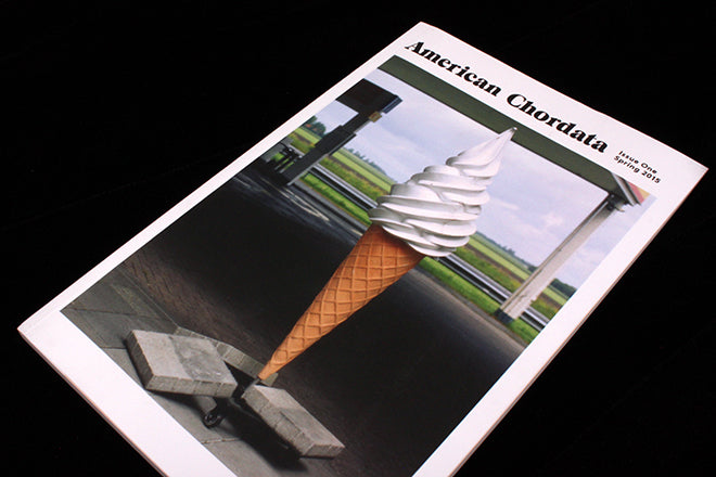
 The magazine is free, sparsely designed and small-sized (140x218mm), and on the website the editors encourage you to print it out from your home computer so that you can read it off the screen. This technique of sidestepping that tricky complication of world-wide distribution whilst still keeping a paper format is an idea that Hamish Hamilton’s literary magazine Five Dials also implement – the concept seems perfect for text-based publications, where you don’t need a complex printer to render each of the pages.
 Colours are vibrant and clean, and plenty of white space adds to the sense of distilled clarity that the magazine cultivates (above).

 A series by Tammy Mercure is bold and up-close (above), perhaps not easy on the home printer, but strikingly effective.
 Illustrations by Louis Fratino are gently detailed with a hint of whimsy (above), and they also contain a touch of Renoir, like Colby Halloran’s accompanying story.
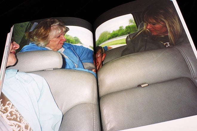
 A wonderful series by Talena Sanders candidly illuminates American child and teen hood in analogue (above).
 Other images of note: sun-burnt skin and thick brush strokes by Ally White are pleasingly dense and alluring (above), and Thomas Prior’s photography harkens to the magazine’s name because of its slight Twin Peaks, suburban vibe (below).

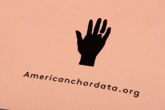 And a last pleasing detail: at the back of the magazine, a tiny little hand is printed in the bottom right corner like a stamp, a little nod to the hand-held format (above).
If you asked the American Chordata team why on Earth they started a literary magazine, I’m sure the answer would be clear. They have a precise vision, one that encompasses words as well as visuals, and a light aesthetic unlike that you usually find in dense, text-heavy publications.
Editor: Ben Yarling
Art director: Bobby Doherty