Amuseum #3
Flipping through a new issue of Amuseum gives me that same sense of joyful curiosity that I used to feel when getting handed illustrated, explanatory pamphlets at the Natural History museum growing up.
For someone who enjoyed trips to places like the V&A as a kid and then got into comics as a teenager, Amuseum is the next logical step of favoured reading material – a magazine about historical objects that’s illustrated by a host of vibrant, lively contemporary image-makers. Illustrator Dan Stafford began the publication last year, and now looking closely at the third issue, it’s clear that the magazine has come into its own.
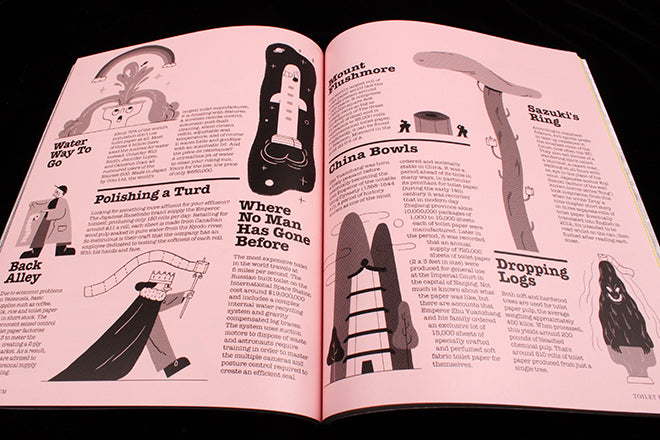
As noted on AIGA’s Eye on Design by writer James Cartwright, a third issue means that Dan no longer feels like he’s got to prove the magazine’s worth. He’s relaxed and he can now experiment a bit more – the concept has been established and people like it. The employment of a new printers means that the physical construction has changed – now Amuseum feels more floppy and open, less dense that it did before and more approachable, which suits its overall illustrated and written tone. There’s a greater range of stock too, with glossy pages and coloured matte contributing to creating more of a varied pace. It’s still as tongue and cheek as it ever was, though: the centre spread features a powder pink, illustrated bum with a piece of toilet paper slipped between the cheeks (above, a subtle homage to Colors issue 25, I wonder? Since the magazine is in many ways a celebration of design history, I wouldn’t be surprised…)
A glossy fold-out adds to the continued picture-book vibe of Amuseum (above), and Dan’s own illustrations are integrated into layouts of text so that editorial design, drawing and words seamlessly meet (below).
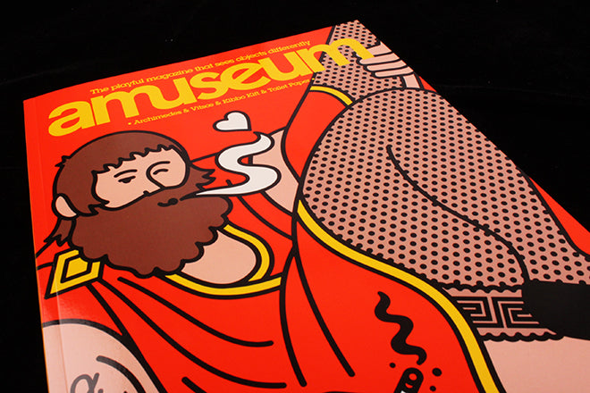
A comic contribution from Antony Huchette (below), the cover drawing by Rami Niemi and editorial illustrations by Elliot Kruszynski (also below) add other lively dimensions to the pages. Amuseum is currently one of the strongest examples of an independent magazine that’s pushing at the boundaries of what can be done with a slick combination of illustration and editorial design.


