

Apartamento #16
A quick search back on this site reveals Apartamento has never been featured as Magazine of the Week. This is a huge oversight. In the recent interview with Mark Kiessling we published, he described how one magazine drove his desire to open his Berlin shop Do You Read Me?: ‘I think it really took off with the interior magazine Apartamento,’ he told his interviewer.
There should be no surprise in that answer. Apartamento is one of a small, select band of indie mags that seem to have been around forever. Like Fantastic Man, Self Service, 032c and Little White Lies, it has helped define the contemporary indie magazine, establishing a distinctive visual aesthetic as well as a confident stategic approach that many have sought to learn from – and many others have outrightly attempted to copy. But that alone is not enough to qualify it as Mag of the Week. The reason it’s slotted in here today is that front cover.
A magazine is more than a front cover, of course, but key to the ongoing success of Apartamento is its founders’ desire to keep challenging themselves and their readers. A problem of success is how to maintain it, but the trio behind the title – Omar Sosa, Nacho Alegre and Marco Velardi – have always wilfully done their own thing. The magazine was launched on their own terms, its success was almost a side-effect, and even as some elements become familiar they still manage to surprise.

 A quick flick through the new issue 16 shows many of those familiar elements: the distinctive headline style, bookish single-column text, pace created by vivid background colours and different paper stocks.
 A highlight every issue is the regular collaboration between art directors Ana Dominguez and Omar Sosa and photographer Nach Alegre. Their series of abstract still lives this time features different papers (above).

Holding it all together is the team’s unique approach to researching and presenting interiors, typified by this example from artist Gary Panter’s Brooklyn House (above). Despite all the high-end luxury advertising now present in the magazine, its basic aesthetic remains as messy and ‘real’ as ever.

The only minor disappointment is the lack of a comic strip – recent issues have featured work by Andy Rementer – but this is partially countered by a beautiful series of paintings by Jean-Philippe Delhomme (above).
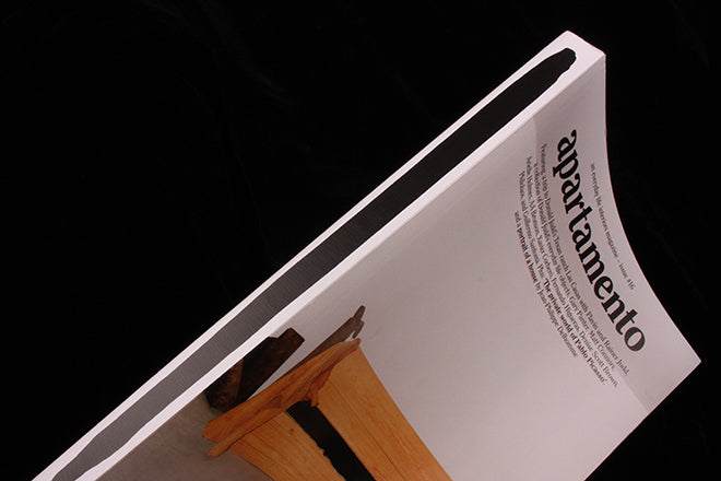
 But it’s that front cover that jumps out. Apartemento covers have always ignored convention, and a quick flick through the set reveals an approach with little similarity from issue to issue. It’s refreshing to see such variation: when people do appear, their back is to camera or they are behind an elevator door. Many don't even feature a person, but this new cover is surely their most challenging yet.
Most of the image, shot by Ryan Lowry, is a sea of off-white wall, ceiling and carpet. Confrontational in its blunt dullness, it takes ‘everyday’ to a new level of banality. It is the strongest symbol yet of the magazine’s outlook – even the central feature, a wood bench, is quite unremarkable. Even the items thrown across it offer little in the way of colour or focus.
The magazine and creative team have found success through their refusal to compromise and its reassuring to find them still in refusal mode.