

April 2016
Our monthly overview of recent arrivals here at magCulture features an international blend of titles covering videogaming, feminism, gay life and anlogue photography.
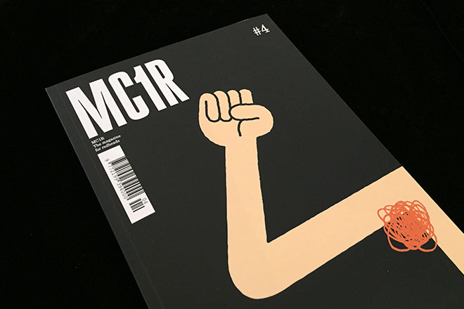
MCR1 #4
The magazine for the redhaired continues to develop, this fourth issue has 162 pages of redhead stories and a smartly sharper design. The illustrated cover (by Tim Lahan) is a new approach too, a cute bit of visual humour that adds character. Each issue profiles and interviews different creatives with ginger hair, who share tips about taking care of fair skin while also talking about their artist output. We’ve enjoyed seeing redheads stumble across the mag at the shop – they always respond excitedly to their ‘own’ fanzine – so it seems like founder Tristan Rodgers is successfully building an audience.
mc1r-magazine.com

Forerunner #1
A common question we’re asked is ‘What niche is there left for a new mag?’, to which one answer has been video games. Forerunner is one mag seeking to fill the gap (another is the soon-come Castle), and this launch is a great start. Refreshingly people-orientated and un-techy looking, this North America issue follows the editors as they travel down the east coast of the States meeting the people behind the gaming industry.
readforerunner.com

Loved&Found #10
Hamburg-based creative agency Loved is yet another example of a company that’s creating its own editorial output to show-off its in-house graphic design and art direction skills. Each edition takes a different theme (like ‘future’, ‘kids’ or ‘sports) and this latest issue 10 is all about ‘Sex’. It’s interesting when compared with other contemporary magazines that explore the same topic: like issue 1 of Ladybeard, the entirety of the publication uses illustration in order to show explicit visuals. Unlike Ladybeard though, the illustration inside is a lot more cute, which doesn’t create that same striking result but rather softens the atmosphere. Visually Loved&Found is interesting because of its combination of independent tropes like heavy use of illustration with elements you’re more likely to find in well-known glossies.
lovedandfound.de

St James’s Correspondent #12
This special 12th edition of the quarterly about the St James area of central London highlights the move of Dover Street Market to Haymarket. The tabloid newspaper makes the most of the story, interviewing DSM president Adrian Joffe, listing ten things you should now about the store, and some nice still lives from Baker & Evans. It succeeds in making St James more exciting than you might expect.
stjameslondon.co.uk

Junko #1
Junko Journal is another new title that uses the magazine format as a way to respond to and evoke place. Ever year, the annual magazine’s team goes to a different region around the world and uses the local geography and creative community that they find as the inspiration for the issue. Similar to Flaneur, the unique location informs the publication’s aesthetic language and content, so every edition is entirely different. Unlike Flaneur, Junko looks specifically at the artists and designers that work in a particular place. As you might be able to tell from the curving, sun-kissed pink type on the cover, this debut issue is all about California.
junkojournal.com

Polpettas #0
Originally a web-only magazine, Polpettas published its first print edition late last year. Published from Madrid by Italian Margherita Visentini, it is trilingual, leading with English but adding Spanish and Italian translations at the back of the mag. Since this heavyweight 216pp pilot issue there’s been a ‘proper’ issue one which I’ve not yet seen; but the pilot feels a little unfocussed and tentative. There’s some nice content in the mix – my highlight is a bright still life shoot of food and bricks – but I’m not quite sure what the whole issue adds up to.
polpettas.com

Orlando #1
As we’ve mentioned on the blog many times before and as countless articles have iterated online, London is a centre for the new wave of feminist magazines that are being produced at the moment. Orlando is one of the newest titles to emerge from the capitol. Its new issue’s theme is history, memory and the future, and it navigates these topics in an intelligent and engaging way. The only thing that lets the publication down is its design and the print quality. As its articles are so bold and brilliantly assertive, I hope that issue two’s layout will reflect this through strong, holistic use of type and graphics.

Take, April/May 2016
Since I last took a look at this magazine from New England, US, it’s a had a graphic remake reminiscent of late-era Blender. I’m not sure the typography quite matches the content, but did like the front cover photo/type treatment of local band And The Kids.
thetakemagazine.com
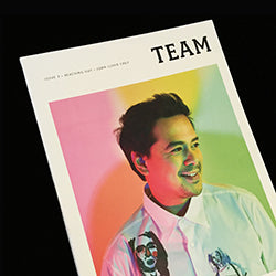
Team #3
It’s exciting seeing new magazines launching in different part of the world, but perhaps the boldest example I’ve seen recently is this smart publication for gay Filipino men. The Phillipines is far from being a gay-friendly environment but that just makes Team even more important; better still, it’s a good-looking, thoughtful magazine.
facebook.com/teammagph

Pylot #4
Against all the pinks, reds, whites, browns and blues of independent magazine covers, I find that this new orange and green issue of Pylot stands out in a particularly striking way. In fact the entirety of the new issue does too, and that’s predominately because all of its shoots are analogue (that and the magazine’s fantastically on-point art direction). We’re always a fan of this London-based fashion and photography mag, and its cohesive fourth issue proves that the title is still growing strong.
pylotmagazine.com

A-magazine #1
This first issue was published by PR agency Naked; the next one will be produced by some of the editorial team as their own magazine (look out for their Kickstarter campaign). The name comes from the ‘A’ added to words to indicate the opposite meaning – think ‘Atypical’. The debut is visually strong but lacks editorial clarity; I’m interested to see where this could go though, the idea has promise.

Sleek #49
For Berlin’s Sleek magazine, a redesign is nothing new. Yet in the past, its layouts have been vibrantly choppy and purposefully fragmented, but this latest look by Studio Lambl/Homburger seems to be taking a lot more from the spacious, emphatic design of Fantastic Man. It’s a long way off from Mirko Borsche’s last visual interpretation for the art and fashion publication. Inside the newest issue, there’s nice use of the typeface Favorit by Berlin-based foundry Dinamo, and I’m enjoying that attention-grabbing electric blue that punctures the spreads.
sleek-mag.com

Leon #2
Luxury, Helsinki-based foodie magazine Leon’s latest issue is theatrical like the first, and I find the new cover especially evocative and very different from what you conventionally see on the stands. It’s so rare to see paint on the cover of a magazine, but as you can see here, the results can be extremely enticing. Issue two is ‘The Critical issue’ and it looks at food culture through interviews and various shoots. As it’s produced by branding agency Leroy, every detail and visual ingredient has been carefully considered and combined like a delicate soufflé.
leon-magazine.com