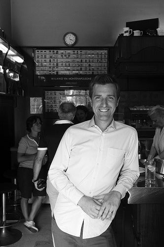
At Work With: Devin Pedzwater, Vanity Fair Italia

American editorial designer Devin Pedzwater has worked for many of the big US publishers, but made his name as the creative director behind last year’s relaunch of Spin magazine and associated apps. He has recently redesigned the Italian edition of Vanity Fair, leading to a life split between Milan and Brooklyn. He shares his week ahead with us.
Where are you today?
The Vanity Fair office in Milan, Italy.

What can you see from the window?
The Piazzale Cadorna train station (above). It has a huge Claes Oldenburg sculpture of a needle, thread and knot (Ago, filo e nodo). It’s completely weird. I love it.
How many emails are waiting in your inbox?
Too many… 235

What’s your favourite magazine this morning?
It’s hard not to be inspired by IL designed by Francesco Franchi. I have a stack of them on my desk.
Your redesign of Italian Vanity Fair was done in New York. Describe the working process between NY and Milan.
At first, the idea of redesigning a massive weekly magazine in a different language 4,000 miles away from the editorial office sounded like an impossible task. But we created a unique workflow using a combination of Google (Docs and Translate), conference calls, PDFs and loads of patience to make it work. In the end, it may have been the best scenario… I was able to stay focused on the redesign while the nine-strong design team in Milan pumped out the weekly issues.
A few weeks ago the entire staff upgraded to CS6 and K4. So I’m now able to access the InDesign files directly from my New York office. While I’m in the US we use the time difference to our advantage; when the staff wraps up for the day it’s early afternoon for me so I pick up where they left off. It becomes a 24-hour cycle, which is critical when we need to quickly respond to news.
How are your Italian language skills?
I wish I could say they were better. I really want to speak Italian fluently, so I’m learning. Let’s just say the staff has been very patient so far.

How much freedom were you given to develop the design rather than copy the US edition?
I was given total freedom to develop a unique design. The Italian edition, being a newsweekly has a totally different content mix and purpose. Also, the Italian audience has no real connection to the monthly US edition, so it didn’t make sense to relate the two directly. However, the magazine has a significant advantage over it’s Italian competition because of it’s relation the Vanity Fair brand. In my opinion, Chris Dixon has done a fantastic job of elevating the brand with his recent redesign. So my goal was to center the Italian edition on those branding elements and then develop a look and feel that addresses the specific needs of the Italian readership.

What was the last thing your editor said to you?
Not sure, but I think it had something to do with the designing the cover? Either that he wanted me to make him a sandwich? Hang on while I check Google Translate...

What are you most looking forward to this week?
Well, I’m making a quick trip to Tuscany this weekend so I’d be lying if I said I was looking forward to anything else.
What are you least looking forward to this week?
Having to cancel my Tuscany trip to redesign a “Royal Baby” special issue.
What will you be doing after this chat?
Getting after that sandwich, I guess.


